
Simple linear regression of official CDC data shows COVID vaccination is associated with increased mortality
If you wanted to prove the vaccine worked, this is the data and approach you'd use. It shows the COVID vaccine was a failure. If you followed their advice, it increased your risk of dying.

Executive summary
If you wanted to show the American public that the COVID vaccines saved lives, the easiest proof is to plot each state (or county) based on its vaccination rate (x axis) and its change in mortality from pre-vaccination baseline on the y-axis.
I did this. The slope is positive.
This means that more vaccinations are associated with higher mortality.
Can this be challenged?
I don’t think so.
The data is the data. They can’t change it. And there is only one way to draw a line through the data. If the shots worked, the slope would be strongly negative and it’s not.
This is likely why not a single paper attempts to do the most obvious analysis. They probably did it, saw that it was not supporting the narrative, and then decided not to publish.
Results for state regression and county regression
The slope was positive and statistically significant for both the state and county analysis. This means that the COVID vaccines did the opposite of what they promised: it increased your risk of death.
The R2 value of .31 is quite spectacular and it means this isn’t an accident.
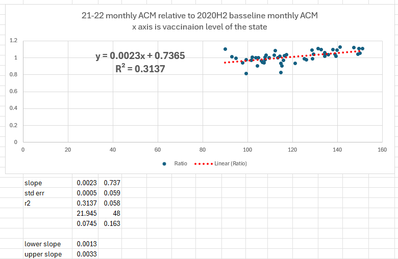
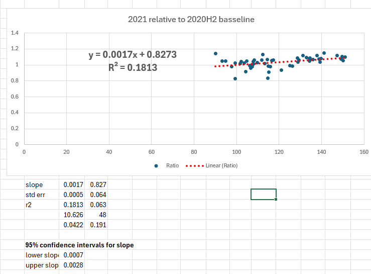
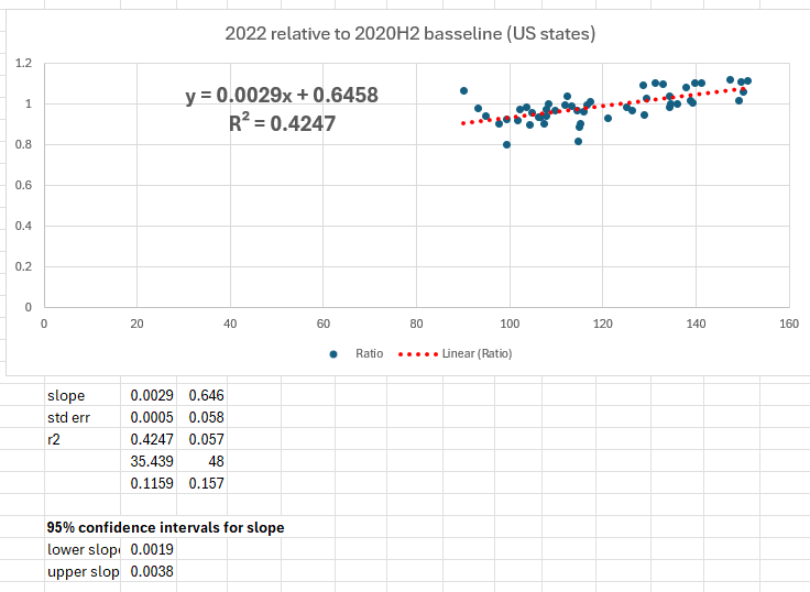
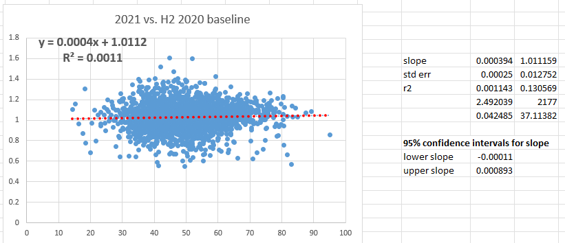
And it’s positive slope for 2021 and 2022 individually:
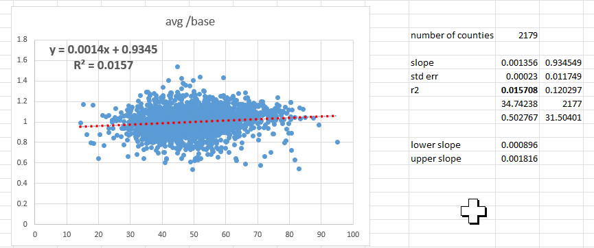
County data
All counties analysis shows the same thing:
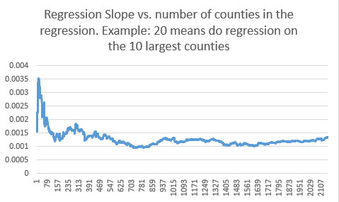
Here it is by each year individually starting with 2021:
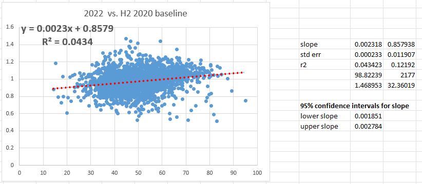
For 2022:
Baseline mortality (the troughs) went up significantly after the shots rolled out
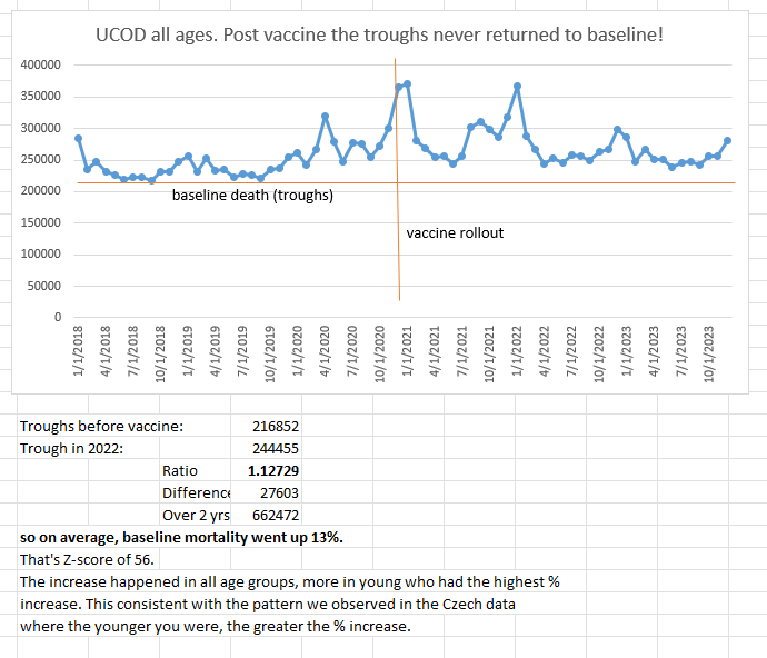
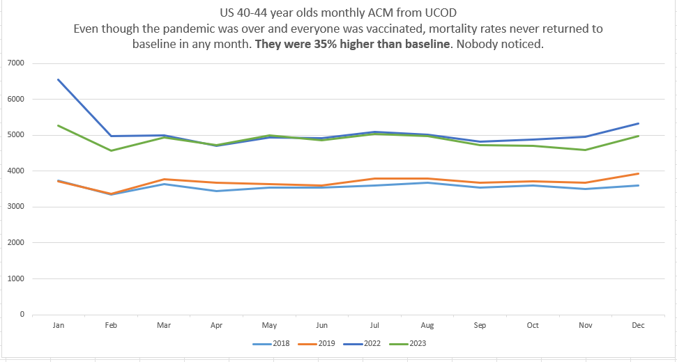
Look at 40-44 year old mortality before the shots rolled out vs. after the shots rolled out. 35% higher baseline mortality, but nobody noticed (except me)
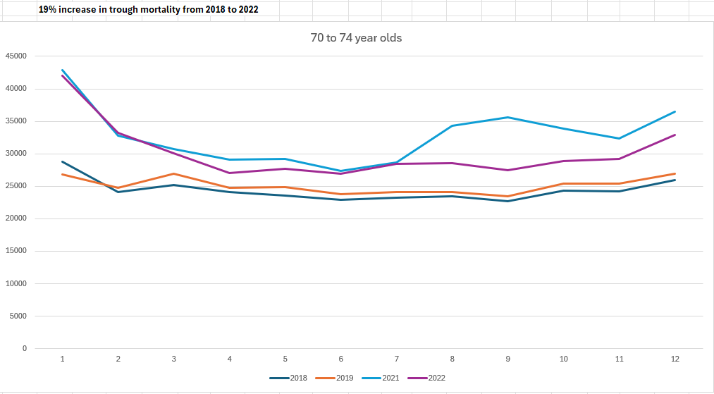
75 year olds baseline mortality
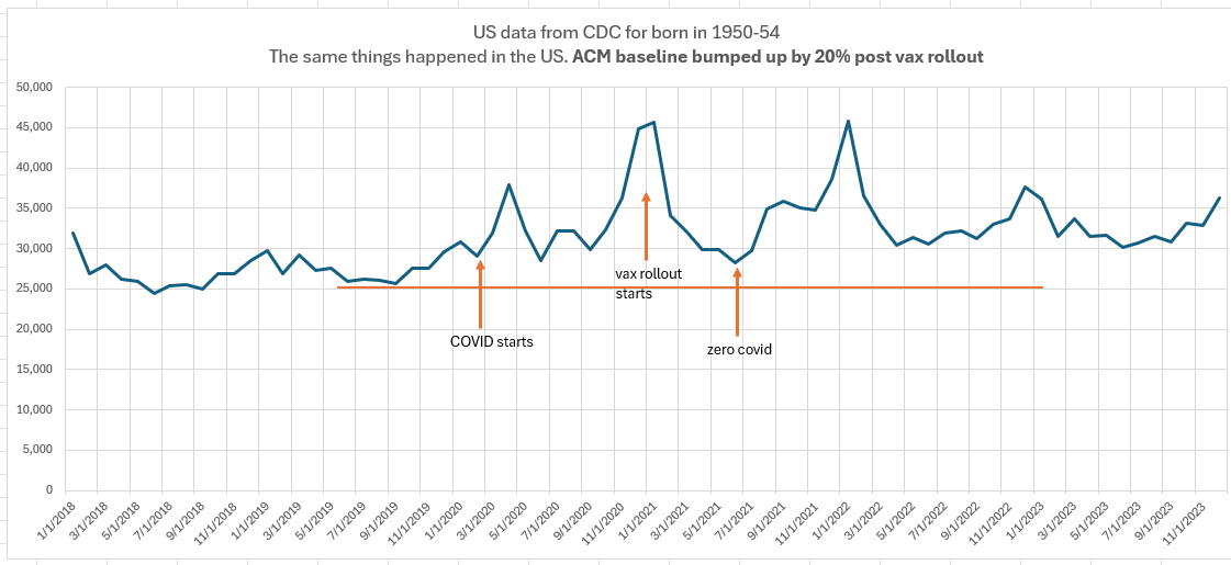
You can see the 20% increase in this chart as well
You can also see that no miracle occurred in 2021 or 2022
The gap between baseline and 2020, 2021, and 2022 are all similar for the elderly who supposedly are now “supposed” to immune to COVID. So what’s killing them at the same rate? Did COVID “suddenly” become more deadly and the vax exactly equalized it? I don’t think so. In 2022, people weren’t dying from COVID anymore, but the ACM was just as high as it was in previous years since the vaccine rolled out.
Data sources
The details
x-axis: doses/100p (as of Nov 2021) for state; % of fully vaccinated (as of Jan 4, 2022) for county
y-axis: average(2021,2022) mortality divided by the baseline mortality.
The baseline mortality is calculated in the same state/county in the second half of 2020 (excluding December since December was half vaxxed vs. pre-vax)
In short, I took the closest baseline for each state/county and compared it with the total 2021/2022 mortality.
The method and choice of baseline were validated by ChatGPT as being the most appropriate and accurate.
It was indeed since the 2021/2022 mortality vs. baseline was nearly exactly 1.0 suggesting a very accurate baseline pick. For the counties, the average y value was 1.0021 which is damn close to 1. So it was an excellent baseline!
You always want your baseline to be RIGHT BEFORE the intervention and it should be very close to the numbers right after the intervention.
Did I make a mistake?
If you think I made a mistake, let me know in the comments.
The analysis is as straightforward as it gets.
Download the CDC data, create a pivot table, create the x and y values, and plot it. Or start with the spreadsheets in the Data section above.
No sleight of hand involved.
39 country study is confirmatory
Jarle Aarstad just published a study showing this graph with an R2 of 57%:

“Analyses from 39 countries with over a billion inhabitants show that per capita corona vaccination doses explain nearly 57 percent of the variation in all-cause excess mortality, with a beta value of .75 (1 is a perfect correlation). A conservative estimate is a ten percent higher mortality rate in high-vaccination countries than in low-vaccination countries.”
“Are there alternative explanations? No. The study has controlled for different countries’ accumulated excess mortality, socioeconomic development, median age, and population size (6).”
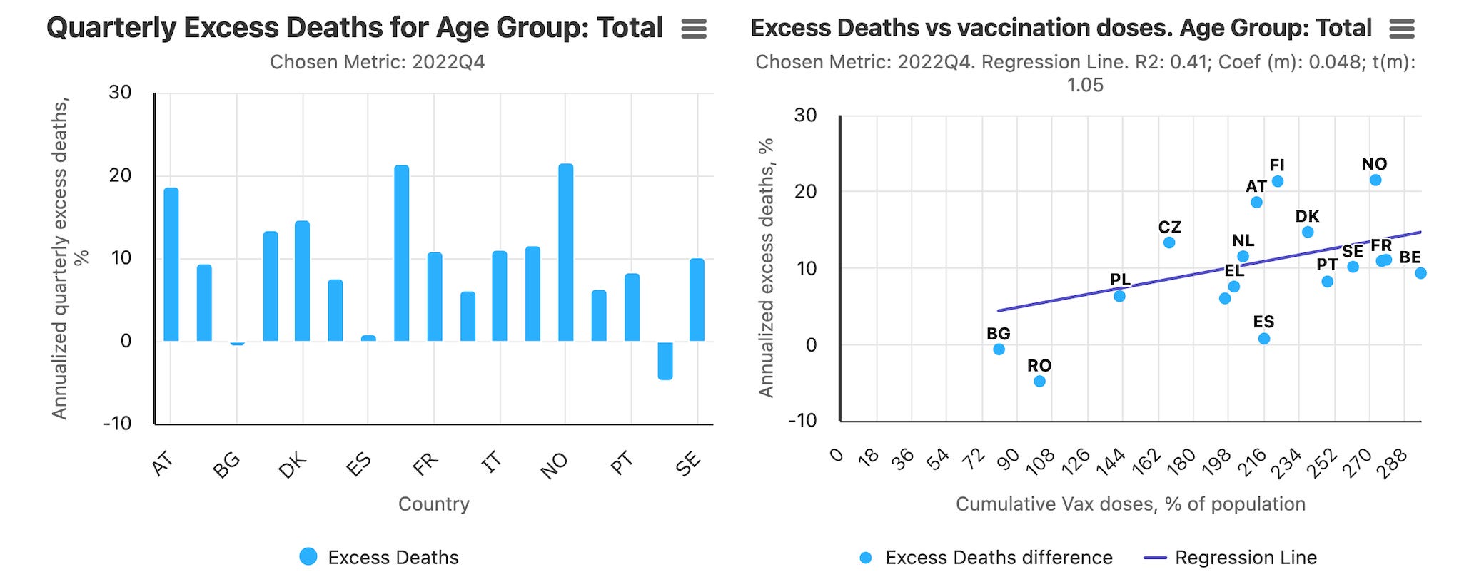
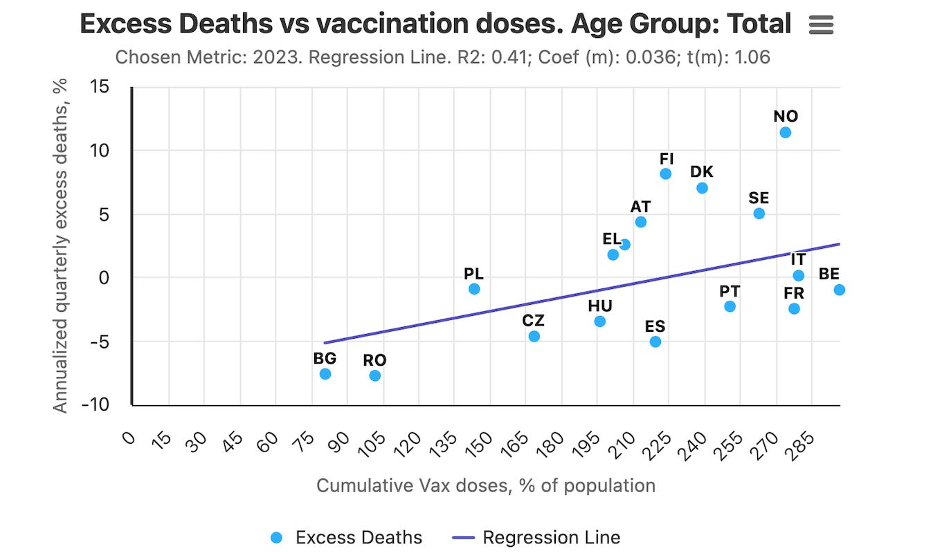
Ed Dowd’s Excess Mortality Project analysis is confirmatory
This is for all ages in Q4 of 2022. R2=.41.
This is for all of 2023 for all ages:
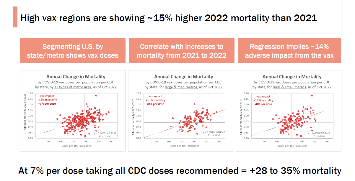
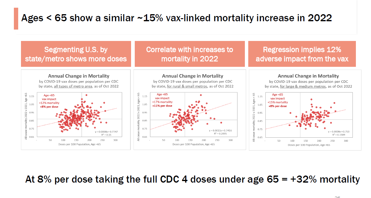
This US analysis is also confirmatory (done by a friend who has to remain anonymous)
This is US using CDC data. It goes into <65 vs. >65 in all regions, large metros, and small metros:
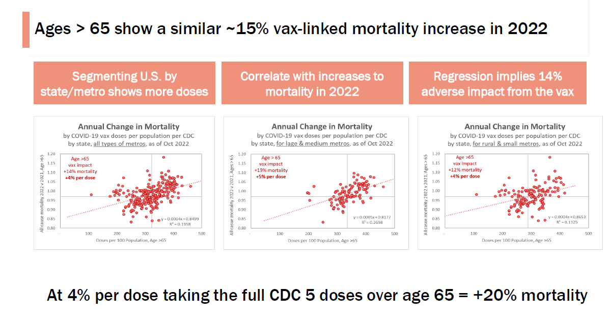
If the vaccine worked, there would be a “knee” in the curve when the vaccines rolled out. There is no slope discontinuity at all!
Look at how the unvaccinated countries “pull away” from the highly vaccinated countries which, despite the vaccine rollout, have no slope discontinuity at all.
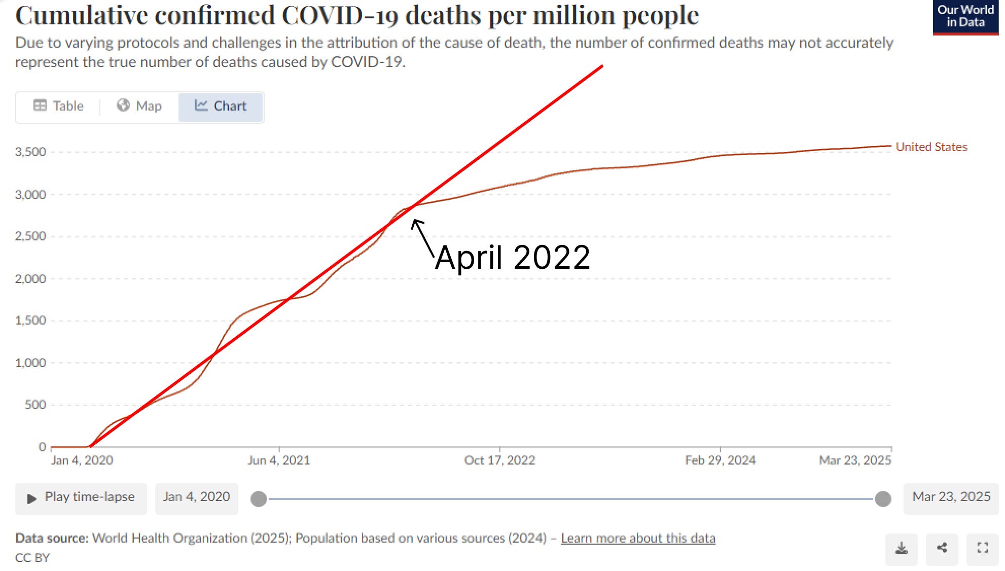
Here’s the US
We break from the line 15 months AFTER the vaccine rolls out.
Summary
There is simply no way to spin this as the vaccine provided a benefit.
All the data is from the CDC and there is only one way to draw a line through it.
If the vaccine worked, they’d be promoting these graphs to prove to you it worked.
But the graphs show that the CDC recommendations were more likely to kill you than to save you, so that may be why they aren’t promoting this data.
I asked ChatGPT for a comparable analysis of the CDC data showing the opposite slope for the change in ACM vs. vaccination rate and it couldn’t find a single paper.
So now you know.
Do you enjoy my posts?
If you appreciate the work I am doing and want to see me continue to provide these types of insights, please consider becoming a paying subscriber for just $5/mo. Thanks!
Safe, effective and necessary...that's what is still being promoted...even on infant and childhood vaccine schedules...why isn't RFKjr, Bhattychara etc... removing them from the schedules immediately? Are they concerned they don't have enough data!to support their actions?
I try showing data like this to my wife, whom is twice-jabbed and whom believes nothing unless the talking heads that inform her say so. How does such a person get exposed to this data that the TV people do not want to talk about?