Attempts to discredit the New Zealand data fall short. Way short. Anyone want to bet me I got it wrong?
I will debunk these as needed. I'm also offering to bet $250K or more that the NZ data can be used with publicly available data to show that the COVID vaccines are killing people. Any takers??
Executive summary
A bunch of people are making attempts to discredit the NZ data leaked by Barry Young who is now facing 7 years in prison for his actions.
All of the “analyses” claiming “there is nothing to see here” are flawed, but I’ll let you decide that for yourself.
I’m going to start with the “analysis” just published by OPENVAET and another he co-authored with DR AH KAHN SYED. I’ll add to the list as more are published.
I assure you the NZ data is real and all attempts to discredit the data and what it says will backfire on those who attempt to do so as I will demonstrate in this post.
I’m offering to bet anyone $250K or more that the NZ data shows the vaccines are unsafe. I’ll be thrilled if I get any takers.
But this shows you that none of the people who boldly claim I got it wrong have any confidence in their “analyses.”
CLAIM: “The "New-Zealand whistle-blower" story is a dead-end for valid arguments”
“Too many people are falling for the New Zealand Data trap. There are no alert signal (sic) in the New Zealand mortality trends and the data released is unusable.”
“Alterations made to the data by Kirsch are forbidding serious re-analysis”
“The data made public has been “obfuscated”. In layman terms, this means it has become impossible to verify, and useless for any form of real analysis”
For all 8 ten year age groups listed in the article, 20 and older, as well as for all age groups combined, the per capita deaths in 2022 were higher than 2020.
“Furthermore, Kirsch is now undermining Andrew Bridgen's efforts in the United Kingdom”
Wow. This is an evidence free post. Let me respond to each point.
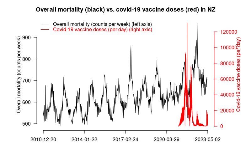
There are huge alert signals if you have spent time with the data. The definitive analysis method for an intervention like this is the time-series cohort analysis. Yet OpenVAET doesn’t even mention they looked at it. That’s just ridiculous. He simply does a population analysis and finds that deaths are up for all 8 ten year age groups compared to 2020, so he says nothing is happening in New Zealand. Here is the mortality by week in New Zealand. Does it look like nothing is happening here?
He doesn’t explain what alterations we made, so how can he know the data is unusable? We ran the time series analysis on the original data and on the obfuscated data and the results were an EXACT match. And that’s the definitive way to analyze this data. So I’d like to see his EVIDENCE that the data is unusable for analysis. He provides NONE whatsoever.
See #2.
The data he shows shows mortality increased in every 10 year age group from 20 years on up. So how is that a nothing burger? Had they looked at the time series cohort analysis they would have found huge signals, but they decided not to look.
For proof of #5, they cite this tweet with 153K views. This was Andrew’s idea. Read the comments. Does this sound like I’m undermining his efforts? I was a major funder of the whole event in Parliament.
If you are going to criticize someone’s work, the least you can do is look at it first. If you look at the graph I posted above which is publicly available data (if you know where to look), it’s pretty clear something is wrong and it is crystal clear in the time series data which they NEVER looked at. Something is causing record level peaks.
Claim: “The New Zealand "whistleblower" data is a burger of nothing.”
This new article is co-authored by Dr. Ah Khan Syed.
The key claims include:
This is the definitive takedown. There is nothing to see here. The debate is over. (Note: I’m paraphrasing what was said in the title and subtitle and text. That is not a direct quote which is why there were no quote marks around it.)
“The rise in mortality in NZ appears to be explained by the increase in the elderly component of the overall population. That in itself is somewhat bizarre but not a subject for today’s analysis.”
“This curve shows nothing but a slight increase explained by the aging of the cohort.”
What you can see is that there are actually less deaths in the cohort than should be expected based on the background data - about 14% less
The data was deliberately “released as bait” and it under-reports deaths:
Wow. Once again, they ignore the accepted definitive way to analyze the data (time series cohort analysis) and they “roll their own” analysis method and model. They cannot be questioned on this since they are the experts and they don’t have real names. So let’s tackle their key points:
Anyone who claims their analysis is the final word shouldn’t be trusted. Science is all about questioning and being open to be questioned. These “scientists” are claiming they got it right and the case is closed. The NZ data has lots of signals. Just because these two people are incapable of finding the signal is not proof that the signal isn’t there. And the fact that they never look at the time series data and claim no signal is preposterous. They’ve both destroyed their credibility here. In the earlier article, they said that the data can’t be used for analysis. Now they say that they’ve analyzed that same data and there’s nothing to see there. Which is it? You cannot have it both ways.
Wow. Maybe you should get to the bottom of the mortality rise issue before declaring the data Barry released don’t show anything?
The curve they show is too confounded to show anything. And then they give a hand-waving “This curve shows nothing but a slight increase explained by the aging of the cohort.” Really? Where is the evidence behind that statement?
There are less deaths in the cohorts when they first get the shot. It’s called HVE and there are two types. I talk extensively about this in my upcoming article on the NZ data. They are completely unaware of the effect which tells you that they are newbies with respect to analyzing vaccine safety data.
Where is the evidence this was “bait?” AFAIK, there has NEVER in human history been a case where a health authority released manipulated data in the guise of a data breach. Any health authority that pulled such a stunt would destroy any remaining credibility that they had. The authors do not cite a precedent. I’ve spent hours talking to Barry and nearly 2 months analyzing the data and I am constantly amazed how it passes all the statistical “tests” I throw at it. I analyzed it in ways nobody would have thought of and the data is well behaved with no anomalies. If the data is bait, where is the proof in the data or in an admission? These people are simply making this stuff up out of thin air.
The third article
You can view the third article (this is written by OPENVAET) here.
Points this time include:
Steve then arguments with a chart showing an apparent 2022 rise in all cause mortality. No source. No code.
As anyone can see quite clearly on this second chart, the vaccinations occurred mostly after the spike of the 2021 deaths
The jabs (within the short term experience we currently have) will kill and maim mostly short-term due to variable-by-batches endotoxins impurities, what would be the suggested damage mechanism for deaths occurring around a year later, according to Steve ..?
Long story short, Steve doesn’t understand the model.
The man simply doesn’t understand the notions of aging of a cohort or of seasonality of deaths.
Steve can keep looking for excess deaths in a cohort and database under-registering deaths if it amuses him.
Note: I offered Steve an alternative bet. Debate on the issue, the loser retires. Let’s hope he will take it.
and so on.
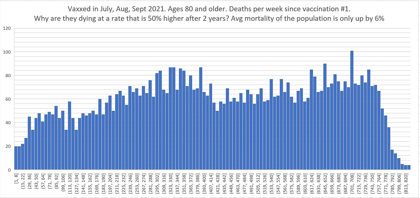
My response to all this is simple: can we stick to the NZ data? Here’s a chart of deaths per week of people who got shot 1 in July, Aug, Sept 2021 aged 80 and older. Simply explain how the deaths per week goes up by 50% or more over time. It’s supposed to be going down
To the specific points:
The data is available publicly. It is telling he doesn’t know the sources for mortality and vaccination data in New Zealand.
Yes it did. I pointed out the the subsequent HUGE spike was AFTER the vaccine.
That is not my concern. My concern is only on plausible mechanism. Injecting a toxic substance into people’s bodies can kill them.
Ad hominem attack. I’ve laid out the cohort time-series analysis and he NEVER finds ANYTHING wrong with ANY of my numbers. No error in buckets.py. No error in the v4 spreadsheet. No errors.
Igor Chudov is reading my more extensive analysis (not yet published). He will vouch that OPENVAET statement is false and defamatory.
The figure above shows deaths are increasing. If the database is under-registering deaths as OPENVAET claims, then the figure above is even more damning. Where is the EVIDENCE for that? It’s only speculation. Is the database under-registering deaths at the end? At the start? By how much? And how do you know for sure? OPENVAET leaves us wondering.
The bet is asymmetrical. People with pseudonyms can easily return. Also, I don’t believe in censoring anyone’s voice. Censorship is a bad thing. I won’t be a part of that.
Igor Chudov’s analysis (neutral)
Igor had the good sense to re-think his earlier comments. See this post.
The Kalev analysis (supportive)
He posted his analysis here: New Zealand Vaccine Data: A Case For Full Data Transparency. He concluded there was a serious problem and it’s time for the health authorities to be transparent with the data. Key points include:
There can be no real trust without full transparency. It’s a non-negotiable.
Those who have data and refuse to hand it over must be presumed guilty.
We have found (strong) signals using a completely different approach which we may document in a subsequent post.
The Skeptical Actuary analysis (neutral)
He’s clearly not familiar with analyzing vaccine data. The two types of HVE effects are real and regularly appear in vaccine data.
He made a follow-up post which ended with “But the very short version of my response is a guess that New Zealand clot shot deaths might be in the range of 1.2 per thousand so far” which is similar to my estimates and is a DISASTER.
The Barry Young analysis by lot number and the M.O.A.R. analysis
I have been focused on the big picture (the time series cohort analysis).
I have not had a chance to look at the lot number analysis in detail. There are 124 lots to look at.
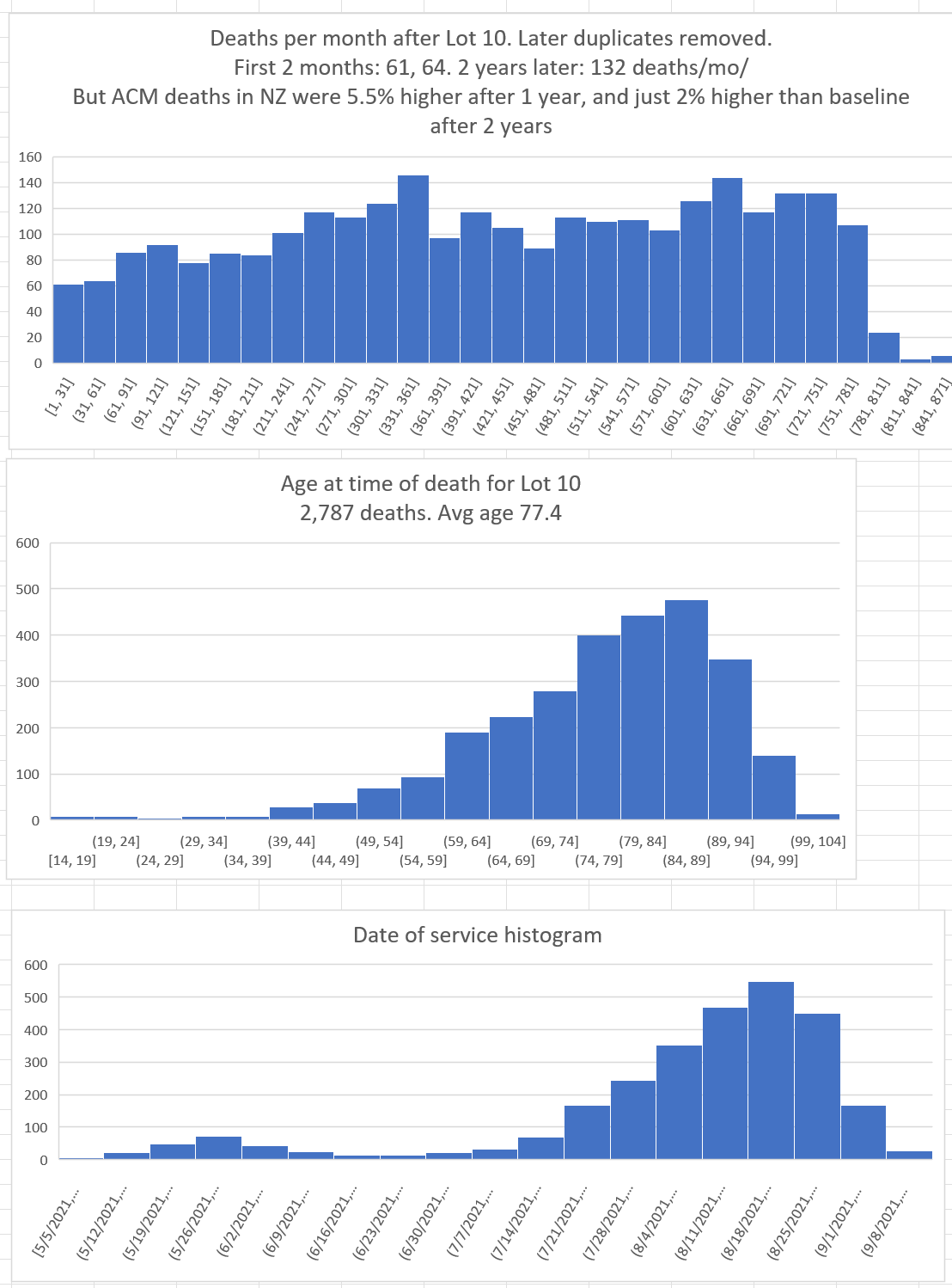
Here’s an example of a huge safety signal in Lot #10 (corrected as of 12/28/23 to eliminate duplicates):

This pattern is impossible for a safe vaccine. I really don’t need anything more than this one chart to prove the vaccines are unsafe.
Yet none of the “experts” will be able to tell you why! I’ll reveal why in my upcoming article. Everyone who claims to be able to analyze data should be talking about this!
What they are really saying to you is “I don’t know how to analyze this data, but I’m going to attempt to convince you that I know what I’m doing and that Steve Kirsch doesn’t.”
History has shown that is a losing proposition.
But just to make this crystal clear to everyone….
My offer to anyone who think there is not a serious safety signal in the leaked NZ data or that the data was gamed or unusable
I’m willing to bet $250K or more that the data is legit and shows a serious safety signal. Anyone want to take my bet? Same terms as my bet with Saar Wilf (neutral panel of expert epidemiologist judges picked by a mutually agreeable consulting firm who vote secretly).
I set the bar at $250K but I’m willing to go to $10M on this one.
I predict crickets.
People who claim I’m wrong and who won’t accept my bet are basically telling you that they have no confidence whatsoever in their analysis.
In Texas, they have a saying for that: “Big hat, no cattle.”
Money is a great way to make that clear to people.
Silencing your critics is not the way forward
I ban people who are abusive and/or time-wasters.
But people who have legitimate concerns shouldn’t be banned.
What do you think?
Summary
I will update this article as more “analyses” come out.
My advice in the meantime:
If they aren’t doing a careful analysis of the time series cohort data, stop reading.
If they claim the data shows the vaccine is safe or is reducing all-cause mortality, stop reading.
If they claim that the data is insufficient, missing data, systematically biased in a way that makes it unusable, manipulated, false, or that you need a control comparison group (i.e., data that is not publicly available), stop reading.
If they aren’t accepting my $250K or more bet, they are basically telling you they aren’t really sure whether they got it right or not. Otherwise, why not take my money?
I’ll be coming out with my own extensive analysis of the NZ data shortly which will make all these points crystal clear. In the meantime, the lack of any takers of my offer should be a pretty good clue as to who got it right.


First they say the data is unusable, then they’ve said that they analyzed it and found nothing!!! You really can’t have it both ways.
In the first article, they’ve already discredited the analysis in their second article!!!
Did you notice that too?
More likely than not, they were paid by Big Pharma to make up a fake rebuttal to your analysis. This reminds me of Pfizer making every effort to hide the data for 75 years. Why would anyone, or any company, try to get away with that if they were innocent and honest about what the data really says. These bastards have been lying since day 1. Given their corrupt mentality, and the deaths and harms that have come from it, they deserve a prison term for life with HEAVY fines.