The NZ data is crystal clear evidence that the COVID vaccine is deadly. A simple, stunning example.
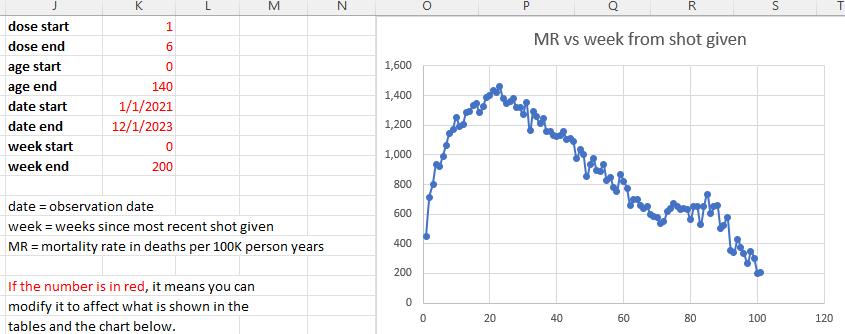
This one chart is all you need to know. Deaths go UP. They are supposed to go DOWN.
Executive summary
The deaths since dose curve goes up in every country and and after every dose that we have data on. Here’s an example from New Zealand.
Introduction
Below is deaths per month since getting Shot #1 in the months of July, Aug, Sept 2021. The x-axis is the months since shot #1 was given. All ages are included so nobody accuses me of “cherry picking.” The deaths are counted relative to the day that the person got the shot.
The reason this is so stunning is the deaths keep going UP every month for the first year.
This is counter to two strong forces causing it to go DOWN for the first 6 months:
In a “safe vaccine” (if there was such a thing), the deaths per day always falls monotonically, typically a few percent or more if the cohort is older. There can be a short period of this being violated if something big is happening in the background and the shot was given over a short time period. For practical administration of a vaccine, the curves always slope down after a few weeks from day 0 (known as the temporal healthy vaccinee effect). The cause of this is it is a fixed size cohort and deaths are always proportional to the number of people available to die. This is why “relatively” safe vaccines (there are no safe vaccines) have deaths per day that always slope down. See this article for a more in-depth discussion of this “gravity” effect.
August is a peak death month in New Zealand (the equivalent of our “winter” in the northern hemisphere). So I chose the peak month of death for when the vaccine is given and two months around that just to get more data points so there is less noise. So there is a heavy bias for deaths to drop over 6 months due to background seasonality (a 27% drop) effects (death rates going down dramatically.
Here’s the graph from data from StatsNZ and you can download it yourself here.
This is from August 2015 by month. The deaths peak every August and the peak to trough varies by 27% in 2021 (=3342/2628).
But if you get the shot, you are able to defy extreme “gravity effects” (both causing you to die at lower rates per week) and die at a higher rate every month for the next 12 months.
This is extraordinary and nobody has been able to explain it if it isn’t caused by the COVID vaccine.
There is no explanation other than it was the vaccine
There is no COVID (that didn’t start till April 2022),
no seasonal effect (it worked to strongly reduce the number of deaths since the vaccination date), or
anything else that would cause the deaths to increase each month. Indeed the background deaths from the chart above show clearly the strong seasonal effect causing deaths to decrease.
The health status of the cohort who took the vaccine is immaterial. Whether it is healthier or unhealthier than average, it simply doesn’t matter: gravity always applies (see next point).
“Gravity” causes deaths to go down (as mentioned above people die in proportion to the number available to die, and as the older die off, the cohort mix gets younger which counteracts the fact that people are a year older at the end). For all cohorts, the death rates monotonically decrease over time for a fixed size cohort at the start. I explain “gravity” in greater detail in this post.
Arguments claiming I’m not competent to analyze data or that I’m a bad person or falsely claiming the data was illegally obtained or that the data breaches people’s privacy are all untrue and irrelevant. People should stick to focusing on what the data is saying: a crime was committed and people are looking the other way.
So why did people who got the COVID shot find their mortality rate increase after the shot when it clearly should have gone down? Doctors are puzzled.
This is not a cherry picked example
This happens in every country, after each dose of the COVID vaccine, but not for other vaccines.
The data is all in the repository I set up for everyone to see. Look at the PNEU vaccine vs. the COVID vaccine in the US in 2021 and 2022. The PNEU drops, the COVID vax increases. It is really stunning.
So this is either the most incredible coincidence the world has ever seen or we have a serious problem.
Another key data point
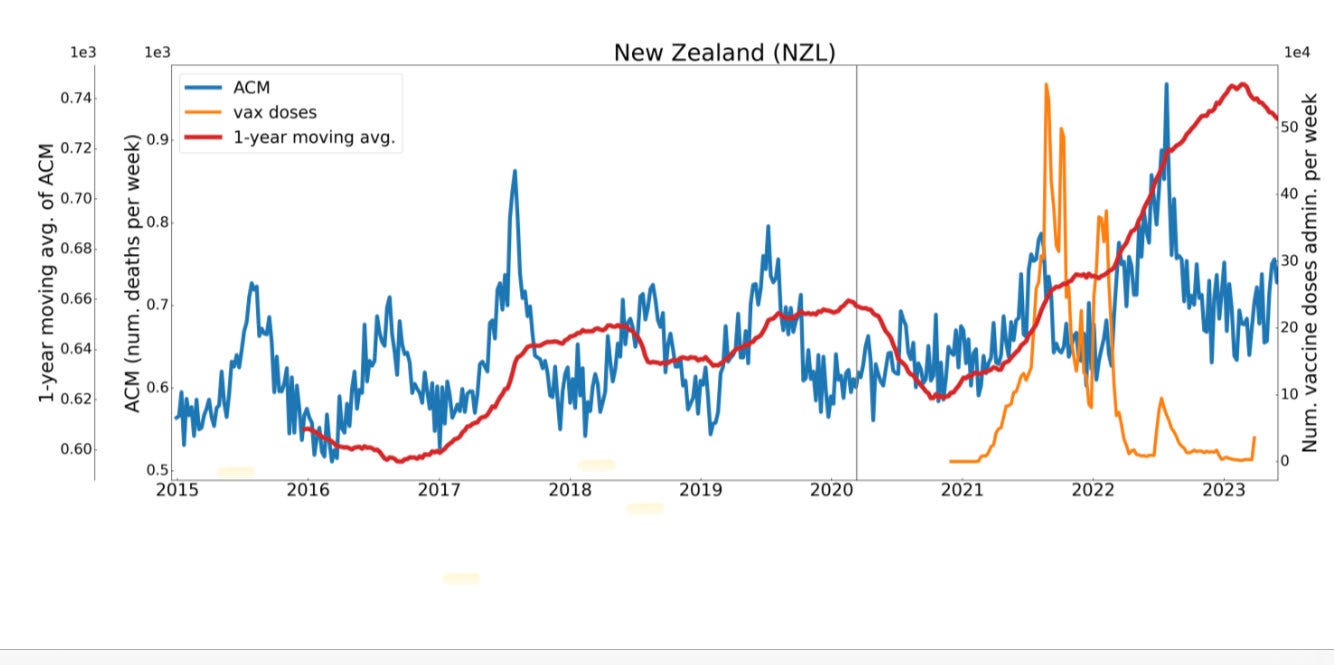
All cause mortality moving average is at an all time high. Why? They are all vaccinated so it can’t be COVID, right?
Kriel analysis
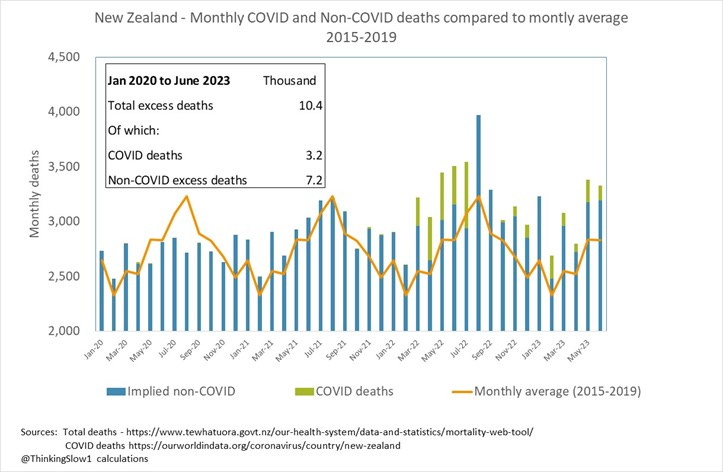
Alex Kriel (aka ThinkingSlow) can’t figure out how to analyze the data properly, but he says that “the acknowledgement that the majority of excess deaths at 30th June 2023 were non-COVID and stood at 7.2 thousand, this is the smoking gun!” He does this by looking at the mortality curves:
which is taken from this post on X.
Sullivan analysis
John Sullivan wrote a Substack article, New Zealand: Serious Vaccine Safety Signals? He is a more skilled data analyst than Kriel and fundamentally agreed the data is useful and the approach I used made sense. You can tell the experts because the rookies (such as Dr. Shiva and Kriel) will discard a dataset at the first sign of difficulty whereas a real scientist will figure out how to work within the limitation of a dataset to find a signal.
Sullivan claimed I analyzed it incorrectly, making an insulting remark, “The issue arises when unqualified or inexperienced “data analysts” (including Steve Kirsch?) misinterpret what they are dealing with”). I wish we could stick to the data instead of personal attacks.
He then goes on to say this:
Someone familiar with time series analyses would immediately see why. The information left out of the piece he cropped contained the Dose numbers covered by the summary graph. You can set this to a single dose or multiple doses. In this case, the Dose 1 through 6 were displayed in the figure which means that a given person can be counted multiple times in the week 0 bucket. That is why there are so many person-days. If you want to see a single dose, just adjust the spreadsheet parameters. The spreadsheet is just a visualization tool.
Here’s the part he cropped off that shows the first dose and last dose included in the graph:

Sullivan was unable to figure this out his mistake.
He next makes the unsubstantiated assertion that “determining a valid cohort of people for each point in his time series, in order to conduct a valid analysis, is a complex challenge.” Wow. Hardly. My analysis is the same as the UK ONS analysis technique. It’s well known. People were entered into the database when they got a dose. You follow them over time. They either live or die. It’s straightforward. The buckets.py program does exactly this. There is only one way to do it and anyone skilled in the art will get the same results I got. This was not a complex challenge at all. We had the software written in a day and it was available before we got the data.
In general, I prefer to abstain from personal credibility attacks like this, but I think it is important to point out that people who claim to be “experts” in data analysis are often just the opposite. The people I respect the most have humility. If he’s going to analyze the data, he should stick to the data and not personal attacks. So with those two bogus attacks, he completely dismisses the power of the v4 spreadsheet as a visualization tool and then focuses on his approach which is claims is the correct way to analyze the data.
Also, I talked to him for an hour and half just now (Dec 15, 2023) and explained to him how he got it wrong in dismissing my analysis and it ended with “ok, you’ve given me something to think about; let me ponder that.”
Sullivan uses a completely different approach to the typical time-series cohort I used analysis. He basically creates a cohort of everyone, aged 80 to 90 who had Dose 1 by putting in everyone who got Dose 1,2, or 3 but eliminating duplicates. He admitted this wasn’t perfect, but said there isn’t a perfect way to analyze this data which is true.
What he did was basically add people to his cohort on the day they were vaccinated so he’s not guessing as to dates. So his cohort grows over time as people are added so the death rate will get more precise over time since he has more people available to die. He then can compute a mortality rate because he knows exactly the number of people he has alive and dead on every day (Note: he did NOT take out the people who died so his denominator is too large so the mortality rate is even higher than he calculated). So we’d expect this to be noisy from the start and then get more precise which is exactly what happens as you can see from the orange line:
He thinks the high mortality rate when the shots are first given out is the red flag. But in my view, the key is the orange mortality rate goes from around 2,500 in August to over 5,000 in December. This is a serious safety signal, a doubling of mortality rate in just 5 months. Moreover, he notes that there is no COVID yet and also is aware, but doesn’t explicitly point out, that mortality seasonality peaks in August, and would be falling by 17% (3342/2856 from StatsNZ monthly numbers in August vs. Dec 2021).
Bottom line: A 50% increase in mortality rate at the same time when mortality rate should be falling by 17% is a huge anomaly and cannot be explained. This is, in effect, a 67% deviation from normal and the numbers are large enough to make this statistically significant.
Sullivan says that his analysis confirms that there “is a significant safety signal in the data.” I agree. So unlike Kriel, he says the data is sufficient to analyze if you know what you are doing (which I agree with). In his post on X, he wrote, Sullivan wrote, “Summary - I don't believe @stkirsch proved a safety signal, but I used his technique to highlight one. Feedback welcome.”
Note that I’ve shown a problem using two different methods: (a) weekly deaths since vaccination time (as above) and (b) weekly buckets relative to the time of vaccination in the v4 spreadsheet, whereas Sullivan used mortality over calendar time for vaccinated people (and was NOT relative to vaccination time). So we have 3 different way to approach the problem and the same result. In this particular article, to make things more obvious, we chose to focus on the beginning of the vaccine program (to avoid the COVID confounding) and we both noted an impossibly large increase in mortality rate that is not explainable any other way.
So now you have in this one article two completely different, but straightforward, analyses that show the same thing: a huge safety signal that is inexplicable if it wasn’t caused by the vaccine.
Be careful which expert you listen to
What’s also notable here is that we have different people proclaiming to be expert and one person says the data is too confounded to analyze vs. here’s how to analyze it and the other says there are ways to analyze what we have.
The best method is to examine both closely. Between Kriel and Sullivan, Sullivan gets my vote because the data is more than sufficient to show a huge safety signal for those with sufficient analytical skills.
What do you think?
Summary
In this article, I picked one example that was particularly stunning, but it happens all the time with the COVID vaccine. The COVID vaccine is so powerful a killer it can defy two very strong effects that normally act to reduce the number of deaths per day after a vaccine dose is given. The effect (higher deaths per day for months after a dose is given) is vaccine dependent and doesn’t happen with other vaccine types given in the same period.
An independent analysis by John Sullivan confirmed the safety signal.
Anyone can verify this for themselves using either method. I’ve provided all the data.
Scientists remain baffled as to what might be causing this effect. But whatever the cause, they know it can’t be the COVID vaccine. That is the one thing that they are sure of.


When I was 9 years old I got paralyzed by a vax... Thankfully, it didn't last long... but next time I went in for a vax soon after then, I quite literally fought off the doctors and the nurses... and I haven't gotten another vax since and I'm 61 now... Thank you so much Mr. Kirsch for your work!
I have several friends that I am sure died of the jab. Many other friends have disowned me because I told them not to take the jab. I put many of them on my mailing list so that they have to delete this kind of data every day. Maybe someday they will be sorry they paid no attention to me. In the meantime, I have a group of friends that love to read your stuff. Keep it up!!!!!!!