
KCOR results on the Japan record level data shows the same harm pattern as the Czech data
The shots increased mortality. No doubt about it anymore. There is no way to explain away this data but my critics are welcome to try.

Executive summary
Existing epidemiological methods are incapable of getting accurate results on vaccine retrospective studies as was finally admitted in the abstract of Obel:
This is why I invented KCOR, a new approach to data analysis. KCOR circumvents the healthy vaccinee effect (HVE) problem because it moves the “cohort adjustment” (so they are comparable) into mortality space instead of trying to do 1:1 matching on observable features of living people (which simply does not work as the Obel paper pointed out).
This article shows that KCOR, when applied to the Japanese record level data (2M records), shows the exact same pattern as the Czech record-level data (12M records).
I’ve reached out to Paul Offit numerous times and he refuses to look at the data. Not even for $1M. What does THAT tell you? It tell me that they don’t want to know the truth.
Resource list
KCOR substack article (including the paper, GitHub repo, 1 page summary, etc)
KCOR applied to the Czech Republic data graphs.
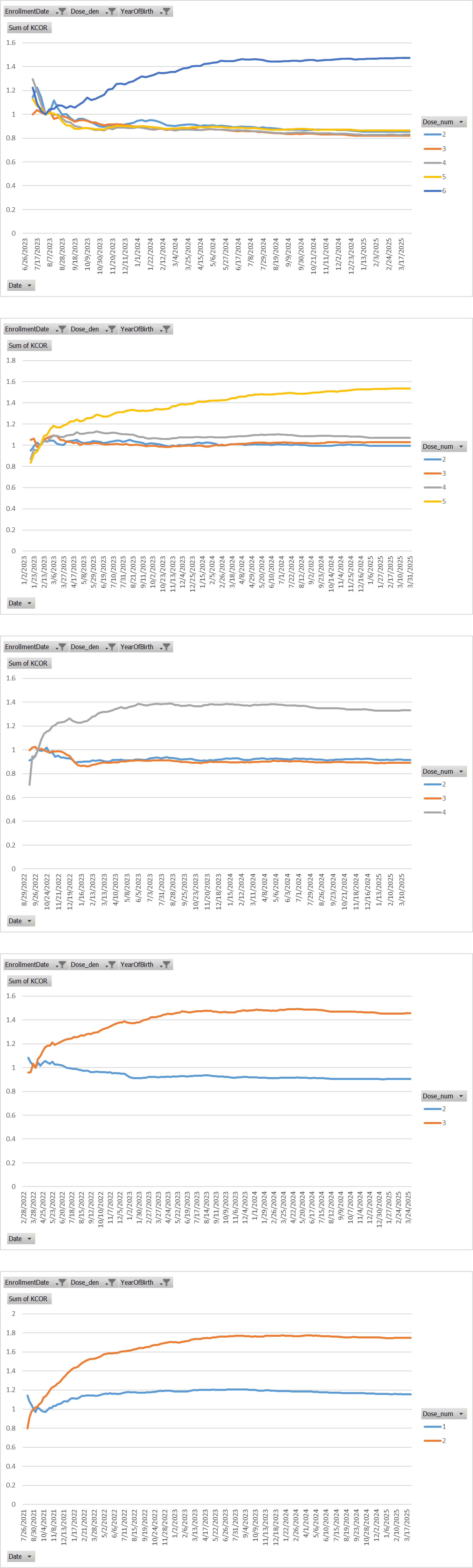
Japan dataset: See the link to the source data at the bottom of the page. Thanks to Kenji Fujikawa for collecting this information and creating the KCOR dashboards (note: these dashboards do NOT do the KCOR gamma-frailty adjustment).
Japan KCOR curves (all ages)
KCOR Values >1 —> Vaccine group is dying more than unvaccinated.
KCOR uses FIXED (at enrollment time) cohorts: no transitions allowed. So a safe vaccine would produce a FLAT curve, not one that rises (then plateaus) shortly after the shot.
It isn’t dynamic HVE either because all the other doses track each other (dynamic HVE would produce a mirror image in the earlier dose).
You can see a telltale rise in all cause mortality is always happening only for the most recently vaccinated group which ALWAYS deviates up. Other groups (those NOT recently vaccinated) are slowly declining from their earlier vaccine mortality elevation.
The only exception is the last chart because people got 1 and 2 in rapid succession and you can see the harms were DOSE DEPENDENT with 2 shots having higher mortality than 1 shot. Dose dependency is a big deal: it’s a hallmark of causality.
If doubling the dose causes a doubling of the mortality with all other parameters kept the same, it’s hard to argue that there is no causality.
Graphs compare the various doses relative to the unvaccinated. Different enrollment dates are used to capture each shot. The most recent enrollment date is listed first.
The spreadsheet is available in my github. It took me literally 90 seconds to make (it’s just a pivot table and a graph).
Interpretation
There is only one plausible explanation for this pattern that I’m aware of: the COVID vaccines increase your risk of death.
ChatGPT, after many objections about identifiability, reluctantly agreed I was correct: there is no plausible explanation for this other than the COVID vaccines increased your net risk of death, i.e., mortality risks were much greater than any “benefits.”
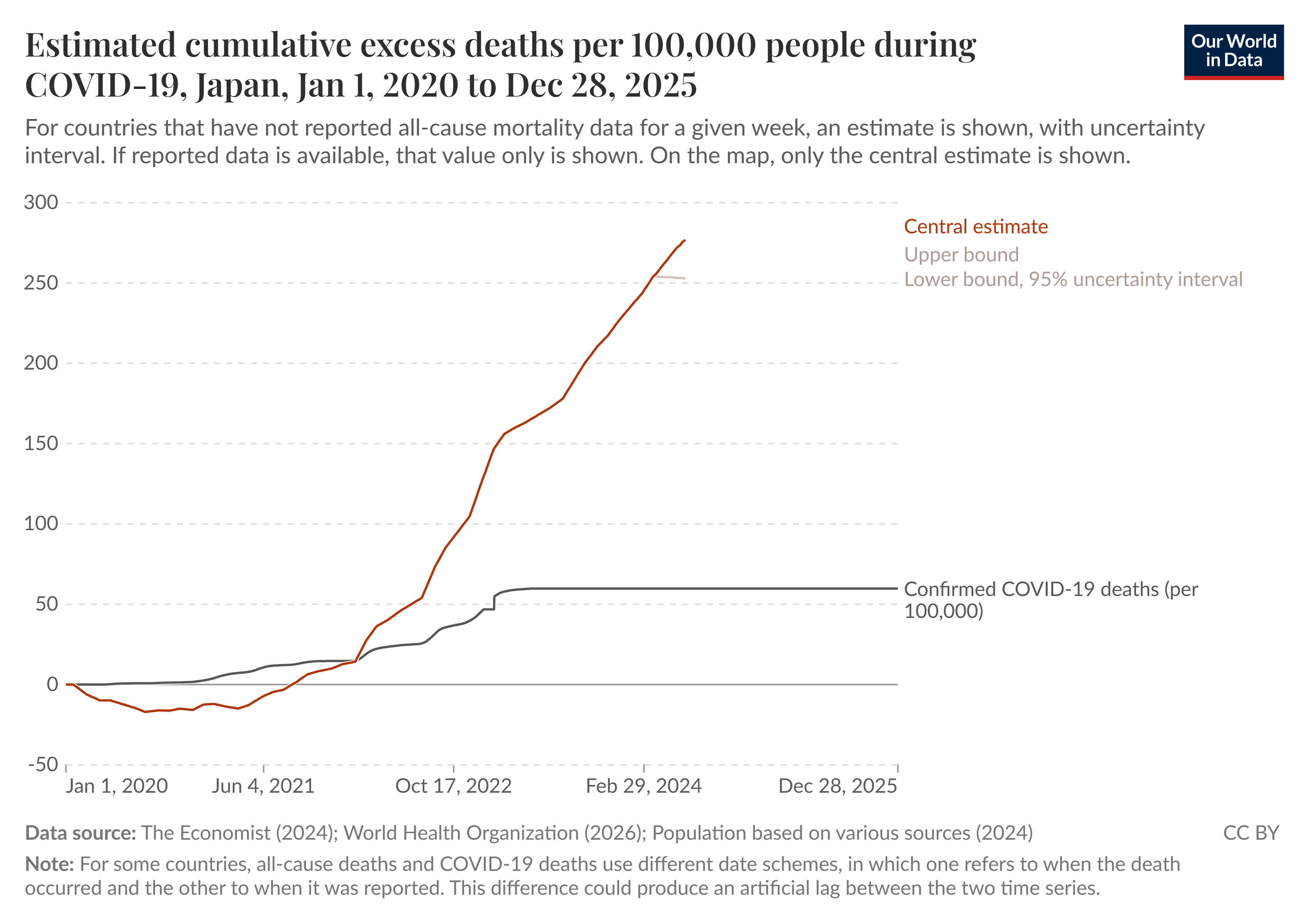
OWID data on Japan shows excess mortality took off right after they introduced the shots
KCOR reveals the truth
Some people have said that the mortality increase is too high and therefore KCOR must be wrong.
KCOR assumes that the vaccine is perfectly safe.
So if you don’t want to believe the result, then that means that your hypothesis must be wrong.
And that’s really the whole point. If you don’t want to accept the result, then you have to reject that the vaccines were “safe and effective,” which then forces you to accept the result that the vaccines were deadly (reductio ad absurdum).
Also, KCOR compares mortality against the unvaccinated over the same period, not against an absolute reference point. The KCOR results above means the vaccinated did much worse relative to the unvaccinated. You can do that and still have no increase in mortality. However, for Japan, excess mortality took off when they introduced the shots:
Summary
No one supporting the shots (including mainstream media) wants to read the KCOR methods paper.
Nor do they want to look at the Japan or Czech data.
They simply want to believe they were right.
They don’t want to be put in a position where they would lose:
their job,
their license to practice medicine,
their board certifications,
their friends and family,
the respect of their colleagues,
or have to deal with the cognitive dissonance.
They all want to put their heads in the sand and hope this all goes away. All of them. No exceptions.
It won’t go away.
The only thing that will make this go away is open debate on the methods and the data.
If I’m wrong, face me in an open public debate.
Or simply explain to the world what causes the healthiest people to suddenly increase their mortality right after every COVID shot if it wasn’t the shots. That should be easy, shouldn’t it?
But they are all afraid of public debate and none of them can explain the data.
So it won’t go away. Ever.
Brilliant work Steve ..
As you rightfully conclude … But they are all afraid of public debate and none of them can explain the data.
So it won’t go away. Ever
Correct … It won’t ever go away, we will not let it, nor will these liars ever be rid of the issue, weak the lot of them, arrogant and entitled is all one can I believe rightfully surmise them to be and to conclude that these supposed learned people of science miscreants are… weak, feeble of character, possessed of a moral turpitude befitting their spineless, inhuman, bereft of empathy and the very basic tenets of what define us as being human beings sums them up…
Their silence is deafening and this matter will never ever be swept aside, forgotten about and every single one of those who refuse the only correct and right option of debating, discussing and actually looking seriously at the data compiled will forever be shamed, it is their unwillingness to so act underscored underlined by their absurd wishful thinking predicate the silence kept by them that puts them all who so regressively act clearly in the cross hairs of the coming opprobrium of humanity that will surely befall them …
To be honest it no longer nor doesn’t matter now how long it takes to have this dealt with as is demanded it must surely and ultimately will be, nor whether such occasions whilst these deniers are alive or posthumously after death, that what can be opined is that resulting their individual and collective intransigence, their group think, commensurate of what is assuredly a contrived and orchestrated response of silence, of ignoring and just wishing it away, a response you’d expect from a young child who is fearful that an act of wrong doing will be discovered and identified resulting in blow back upon them.
In reality such an absurd response and way of dealing with such a serious health and science issue, one that is patently untoward their reputations, qualifications and positions, accentuates the true character or rather the complete lack of character that sadly it seems many possess. By their recalcitrant actions they unwittingly are seriously loading the die to be cast against themselves, a die that when it is finally cast will quite rightly see that they are held to account, called out, reminded of their role in this crime against humanity.
As children we were taught it’s better to fess up, to confront than to obfuscate, to try to hide, or worse to blame others, to hide and or just wish something away as if it hadn’t occasioned as if it hadn’t happened, that unfortunately sometimes our worst fears need confronted in order we can both overcome and learn… like seriously, it really makes you wonder at the level and degree of maturity of a lot of these types…
I for one take solace in the fact there will be a reckoning, that with every passing day we get closer and closer to a proper and full disclosure, thanks mainly to people like yourself, a dedicated group that is growing, that this train has well and truly left the station and there is no reversing it.. it will happen, we will see the full accounting of this dastardly matter, time and the disinfectant of light shone upon the lies, half truths, falsehoods will see to that… again congratulations on your tireless but most wondrous efforts… just saying
Kia Kaha (Stay strong) From New Zealand
You are correct, Steve. And I believe that the mortality of the Covid-vaccinated is not just increasing immediately after they have taken their mRNA injections. My 2024 and 2025 "Worldwide Embalmer Blood Clot Surveys" results show that embalmers are STILL seeing the WHITE FIBROUS CLOTS in an alarming 20% of their corpses, even though most of the population stopped taking the Covid jabs back in 2021 or 2022.
That tells me that this unusual blood clotting side effect, as well as other side effects like "turbo cancers," may actually not show up until YEARS LATER AFTER A PERSON'S LAST COVID JAB!