

Executive summary
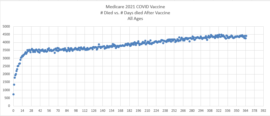
This is from a whistleblower in Medicare. The x-axis is days since the Medicare recipient (mostly those over 65) got the COVID shot on 2021. The y-axis is the number of deaths. The rise on day 0 to 21 is the dynamic healthy-vaccine effect (HVE) which is well known. It’s the rest of the chart that is inconsistent with a safe vaccine.
Do you know why?
The answer
This may be one of my most important posts.
The answer is that the slope of the deaths/day should trend lower over time for a fixed age cohort time-series plot like this one. So instead of turning “up” like this line does, it should be flat and turning down.
The slope of deaths/day depends on the average age of the fixed cohort. It slopes up for cohorts with an average age of under 85, it slopes down for older cohorts. The slope over MANY years gets more negative with time. The positive slope should rarely exceed 8.5% per year which is the human biological constant increase in mortality. For young cohorts, depletion is minimal. At 85 years old, the 8.5% increase due to biological aging is neutralized by the increased absolute death rate, so the slope is zero.
The observation is that the slope here is pathological. Over a one year period, the slope should be the same or it should slope down if nothing is happening.
If Delta/Omicron surface in Sept 2021, we’d start to see the slope START to very gradually increase about midway in the graph. We don’t see that. The slope increase starts earlier and is relatively constant.
For the full analysis as to why this data is inexplicable, see AlterAI.
The other single best chart is VAERS
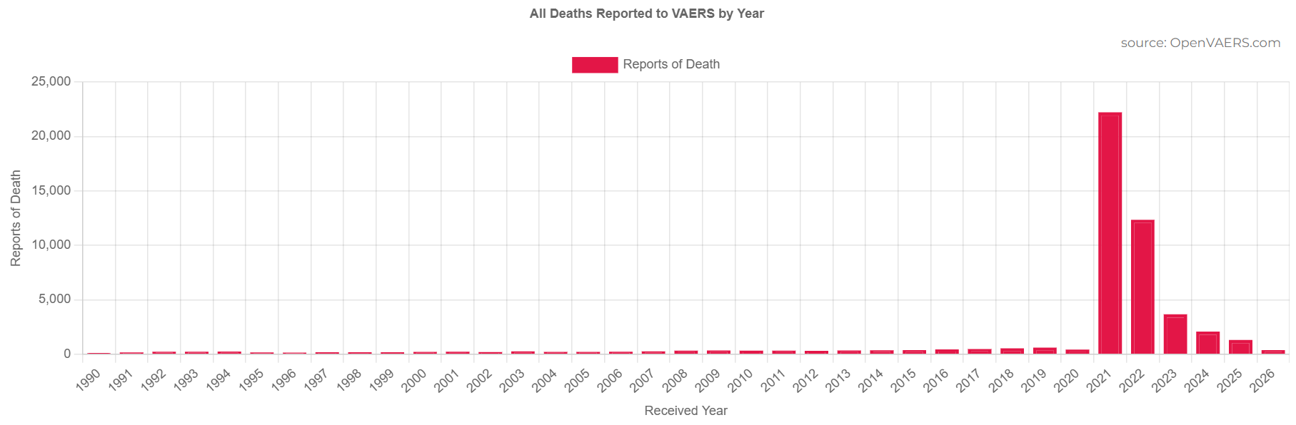
The VAERS death reports are also a smoking gun. That’s not reporting bias or “more people got the shots.” There is no honest way to explain the rise in VAERS death reports.
Was it effective?
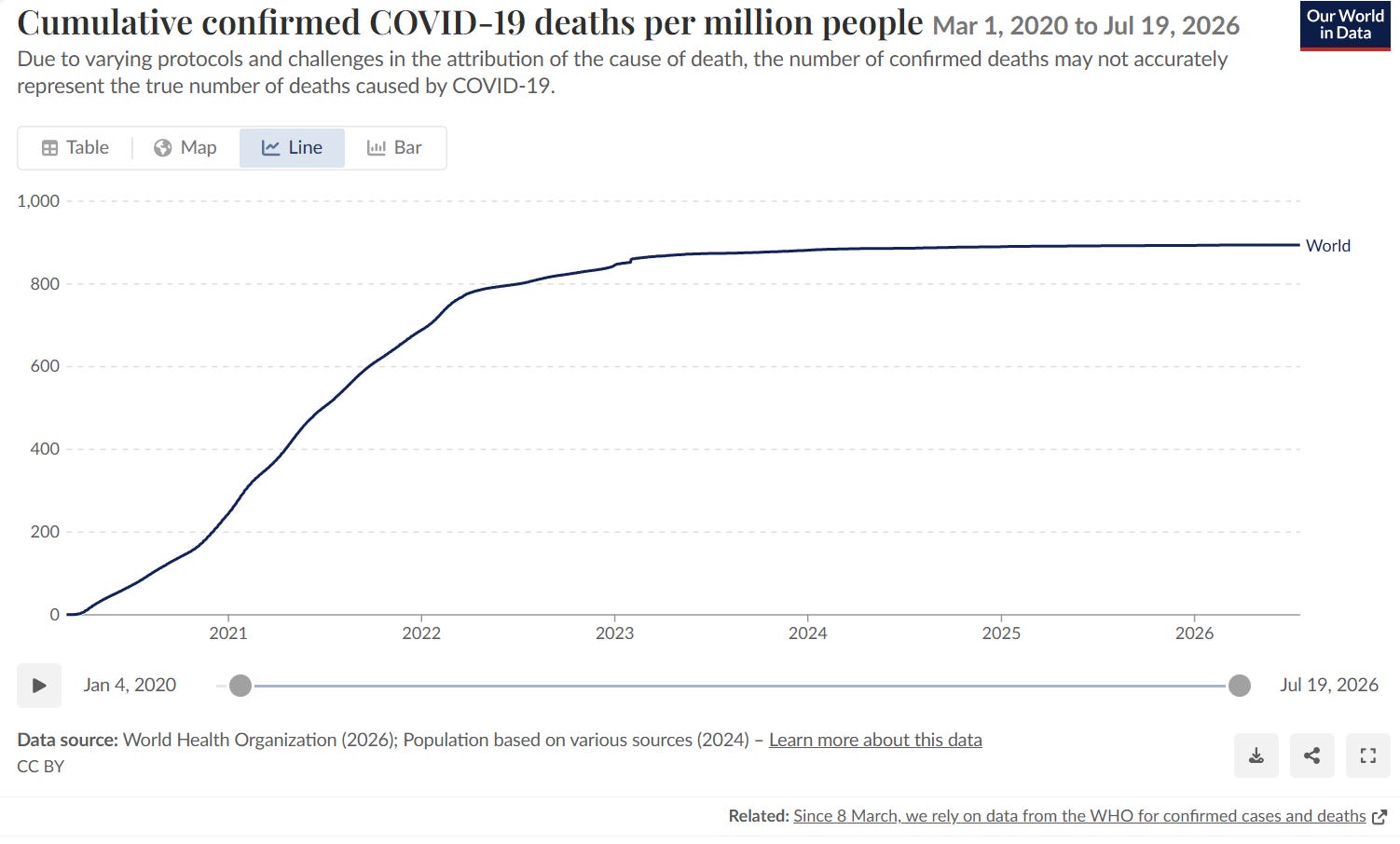
The single best chart is cumulative COVID deaths vs. time. Most of the world got the COVID vaccine but there was no knee in the death curve anywhere. It was a straight line. The vaccine was supposed to “flatten the curve.”
Instead, it flattened worldwide all on the SAME day, March 12, 2022, the day the virus mutated to be less lethal.
Summary
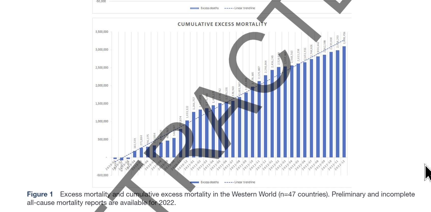
The shots killed a lot of people and the population data shows clearly nobody was saved. That’s why the BMJ unethically retracted the Mostert paper, to cover it up. None of the cited reasons meet the COPE standards for retraction.
However, the journal’s view is that this would be insufficient.Overall, the journal concludes that the discussion of causes of mortality is imbalanced, lacks rigour, and includes misinformation.
THE PLANDEMIC
"The VACCINE was not brought in for COVID. COVID was brought in for the VACCINE. Once you realize that, everything else makes sense."
~Dr. Reiner Fuellmich
I hope you give that whistleblower a huge hug and take him/her out to dinner! Please tell the whistleblower thank you as this Medicare info was so vital to receive. That person is a hero!