
Japan COVID shot data: Every single time you take another shot, it gets worse. EVERY. SINGLE. TIME.
They Japanese are very obedient, even when the government tells them to take a shot that is killing them off. Japanese officials are likely to keep ignoring the evidence of their mistake.
Executive summary
This is data from Japan. It is meticulously collected. From what I can tell, it’s even better than the Czech data in terms of accuracy.
It shows that every single time you got a new shot, the group with which got the new shot had their mortality shoot up after a brief delay. It happens every single time.
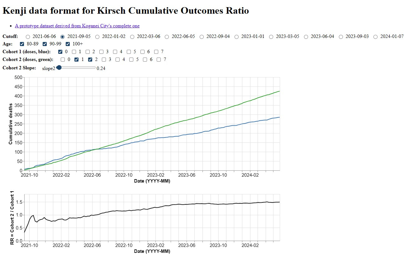
You can try this yourself here which is a website created by Kenji Fujikawa. You can follow him on X.
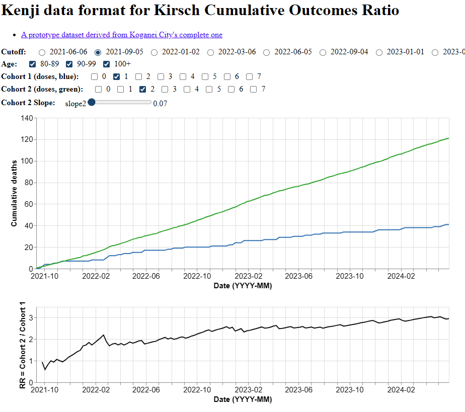
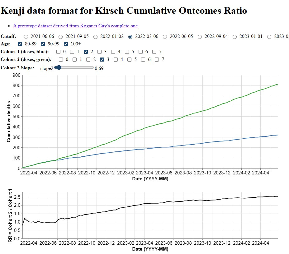
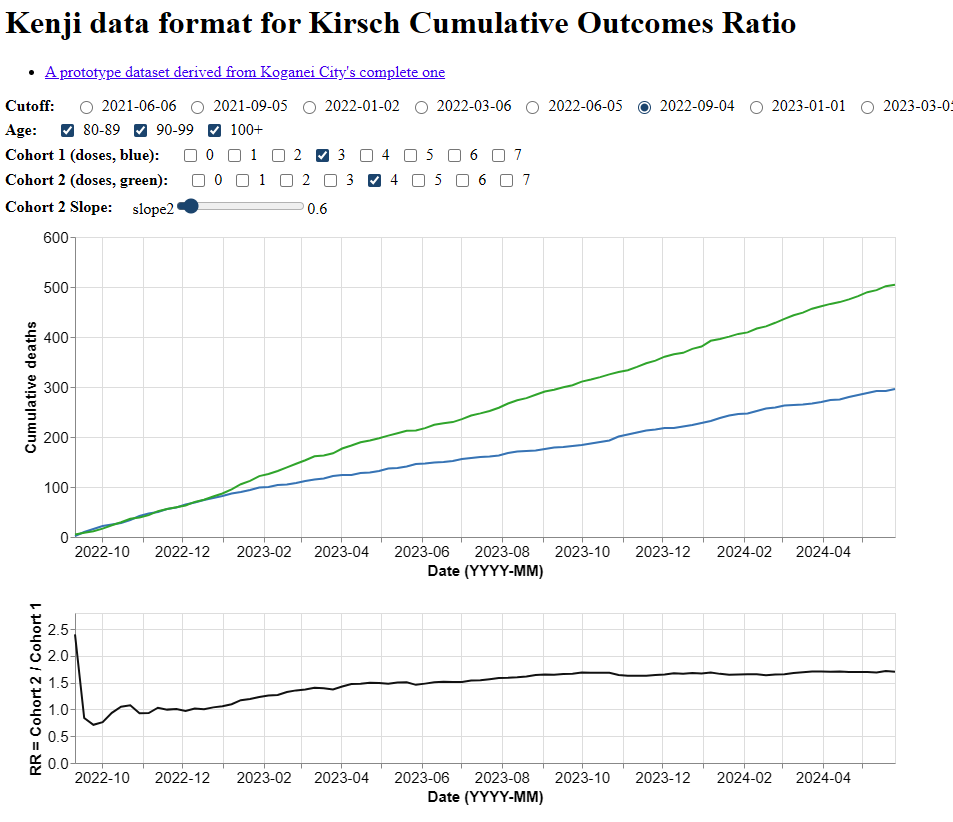
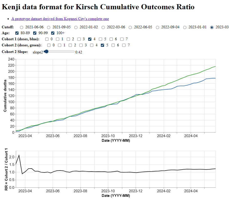
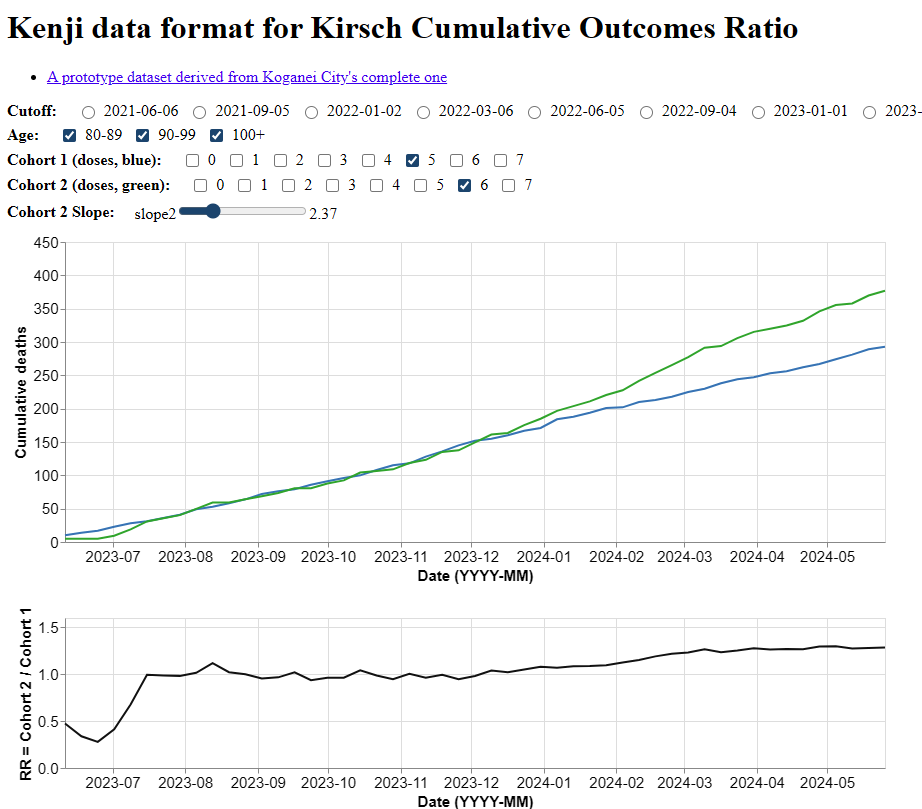
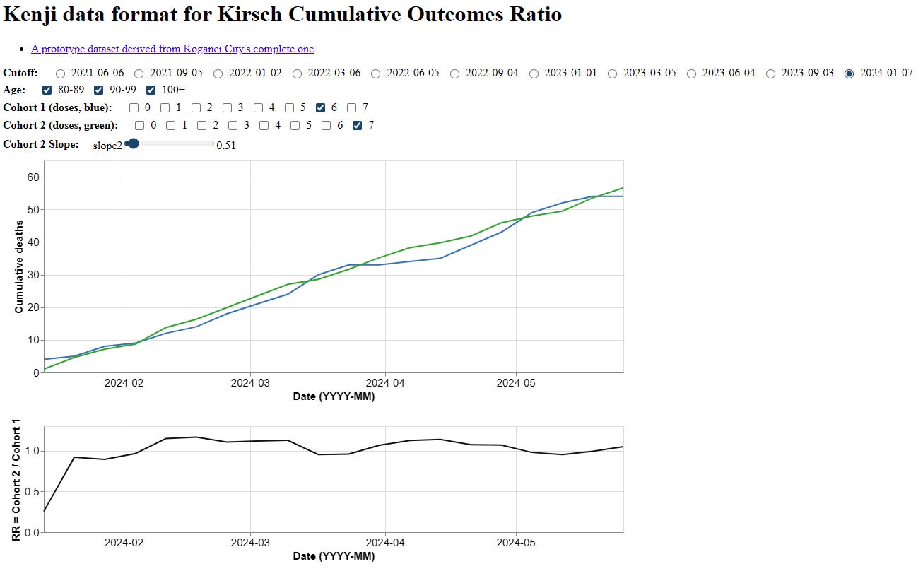
First the cumulative hazard(t) charts
Hazard(t) is essentially the mortality rate: hazard(t)= -ln(1-MR(t))
Cum hazard(t) should follow a straight line (technically an exponential line) if there is nothing going on:
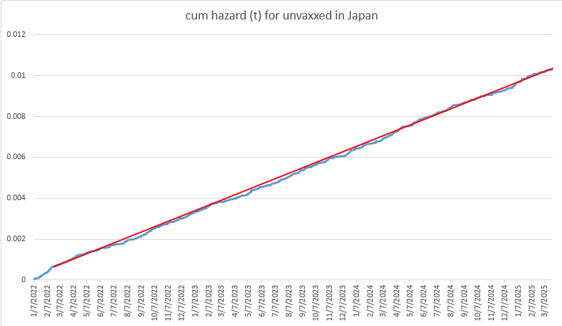
But look at what it looks like for those who got 2 shots. See the difference? The unvaccinated is a straight line. The dose 2 line is straight but then diverges as people in the group get the life saving shot. If the shot saves lives, it should diverge downwards, not upwards. There aren’t two ways to spin this; it’s a fixed cohort. Even if you gave it to the least healthy people, it is supposed to reduce mortality, not increase it.
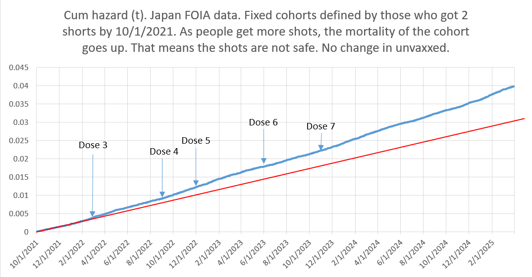
These charts show that the group with more vaccines (green line) always aligns with, then breaks up and away from fewer vaccine group (blue line) every single time
In each chart, I adjusted the scaling so the deaths per unit time would align.
Notice that every time the lines diverge, it is always the vaccinated who are dying more over time. It’s supposed to be the other way around.
There are really only two explanations:
Someone incredibly smart manipulated all the data to make the vaccines look bad
The vaccines are killing people.
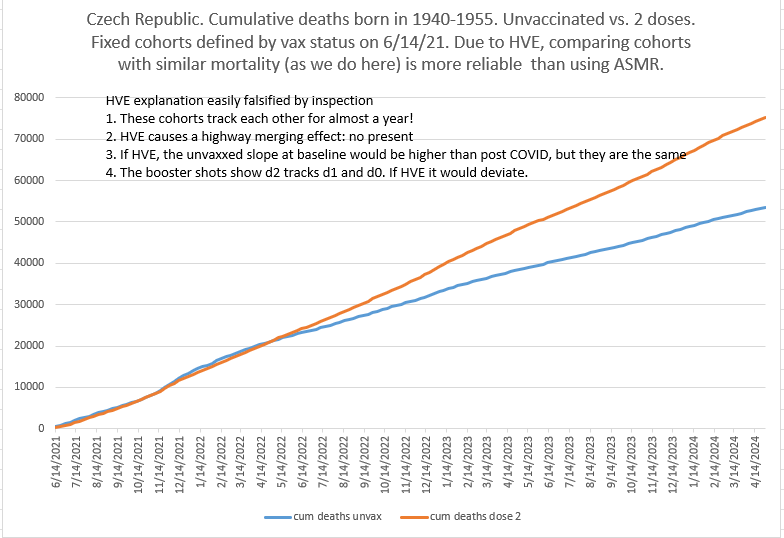
Since this data aligns with the Czech data, #2 is the most likely option:
Here’s the data from Japan where you can observe the same effect by using the publicly available explorer, just like I did.
Summary
Thanks to Kenji for putting this tool together.
It doesn’t get any more obvious than this.
The method used to compare the cohorts here is standard epidemiology (risk ratio in this case comparing cumulative mortality risk).
The deaths/week curves are aligned over a short period, then diverge.
We see the same effect in the Czech data.
This is either the greatest set of “coincidences” of all time, or the COVID shots are unsafe.
Sometimes I feel like the only person in the world who remembers that Moderna originally shifted to "vaccines" because repeated doses of mRNA were so bad for the recipients.
I just can't grasp how can it be that the japanese researchers, belonging to the top of the molecular biology clan, didn't have guts to warn their own fellow citizens??? This is a terrifying betrayal, like, well, everywhere else on this deceptive world.