
COVID time series graphs show clearly the COVID vaccine kill people. That's why they keep the plots hidden from view.
All you have to do is plot the time series graphs and you can see the safety signal clearly. It's not rocket science. So what do they do? They hide the time series data.

Executive summary
The claim that the COVID vaccines are perfectly safe is easily falsified by looking at any time series plot.
A safe vaccine has a relatively flat time series (it may have bumps for seasonality if the vaccine is given over a narrow time window).
An unsafe vaccine has a time series where the deaths per day increase from baseline.
So it’s obvious from the time series data what is going on.
But did you know that none of the papers in the peer reviewed scientific literature will show you a time series plot for the COVID vaccine? I couldn’t find a single one!
And when Andrew Bridgen (along with 6 other MPs) sent a letter asking Professor Sir Ian Diamond the CEO of the UK ONS for the time series data, they told him to pound sand. Read this.
This is one of the main reasons why my substack exists: to publish the data that mainstream scientists will not publish.
In this article, I’ll explain:
what a time series is,
what a safe vaccine looks like, and
what the COVID vaccines look like.
Once you learn this, you’ll be shaking your head wondering, “This is SO obvious. How can the medical community ignore this evidence?”
I’d love to ask them that question, but none of them will talk to me.
And there is no chance that anyone in the mainstream media is going to ask people like Paul Offit that question. That’ll be the day!
What’s a time series?
For a vaccine, you make a plot of the number of deaths per day from the time people got the shot.
If the shots are given evenly over time, you’ll see a relatively flat line with a slope up if the average age is young, a flat slope at 86 years old, and a declining slope if the average age is >86 years old.
If the shots are given during a short time period, e.g., over a quarter, then you may see seasonality effects modulate the curve.
What are the two types of HVE? What is “unicorn HVE”?
You’ll also see a sharp dip that exponentially decays over 21 days and disappears (half life of around 4 days). That is the “short-term healthy vaccinee effect” (HVE) and it’s because nearly 75% of short term deaths (e.g., 1 day later) are predictable and those people don’t get vaccinated because they know they are about to die.
There is also a “long term HVE” effect which causes the mortality of the vaccinated to be much lower than the unvaccinated. This is a PERMANENT difference and it does NOT have a half-life. You cannot see this effect in the time series. Every time you vaccinate a population, you get the same people opting in so it happens every time.
There is also a “unicorn HVE” effect which people like Henjin claim exists. It refers to a 20 week (or more) version of short term HVE. It’s called unicorn HVE because nobody has ever seen it before and isn’t in the scientific literature. You can read about unicorn HVE here and the many ways you can falsify the effect. Unicorn HVE only appears for the COVID vaccine (for reasons that are never disclosed) and is used by people like Henjin to try to explain away the mortality signs.
Time series plots for non-COVID vaccines: a FLAT line
The flu shots look safe don’t they? Surprise! Look at t=0. See y=475? Most people miss that. The flu shots have a strong “zero day” kill effect not found in other vaccines.
But the medical community looks the other way because they are told the shots are safe. The flu shots aren’t safe, and multiple studies (such as the 2020 Anderson discontinuity study and the 2005 NIH study reported by Sharyl Attkisson).
“The more of the elderly population that got flu shots, the more the death rate increased." (source)

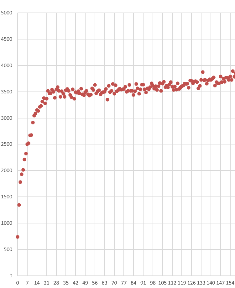
But this is what a time series for a safe vaccine is “supposed” to look like. A flat line.
Here’s another vaccine. See? Same flat line.

Time series plots for COVID vaccines from Czech Republic: not a flat line!
The increase in mortality in just 200 days is mind blowing: 20%, 58%, and 39% for dose 1, 2, and 3. This is for all ages.
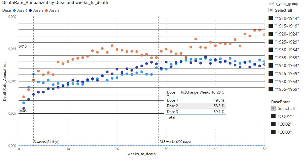
Here’s a close up of the HVE effect which is easiest to see on Dose 1. Count the dots from the left till you get up to the “baseline.”
Harder to see on Dose 2 because it blends in with the much higher slope.

And HVE is harder to see for Dose 3 for the same reason.
Time series plots for COVID vaccines from Israel: not a flat line!
Here are the plots you aren’t supposed to see from Israel.
There is no HVE, likely because if you were alive, you got the shot. The shots start to take effect in 30 days after the shot. Note the 9x difference between highest and lowest deaths per day lines.
A 9x difference and you think it’s a safe vaccine?!?
This is a FIXED cohort of people. There’s one CONSTANT rate of death for any fixed cohort of people.

New Zealand COVID vaccine: not a flat line!
From my “In-depth analysis” article on the New Zealand data.
This is shot 4 data from New Zealand. You can see the HVE ends in 21 days.

This is dose 1. People moved out of Dose 1 and into the Dose 2 bucket. So because the cohort was changing, it’s hard to tell what is going on. This time series basically put people in ONLY the bucket they were currently in, rather than simply show all deaths after the first shot.
This is shot #2. The mortality rate goes from 1,500 to nearly 2,500 in just 7 weeks after the shot. This is at a time when seasonality is driving deaths down.

Here is dose 3 given when seasonality is in an uptrend. Now it REALLY takes off!

So we have mortality rising after the shot, when the background is a downtrend or uptrend.
The only way that can happen is an unsafe vaccine.
There is no other explanation that fits.
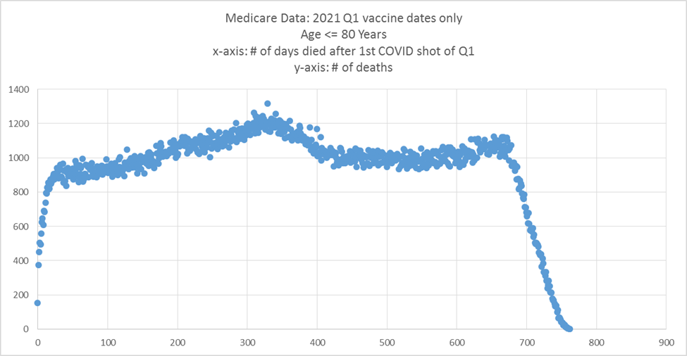
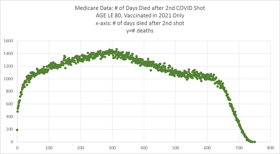
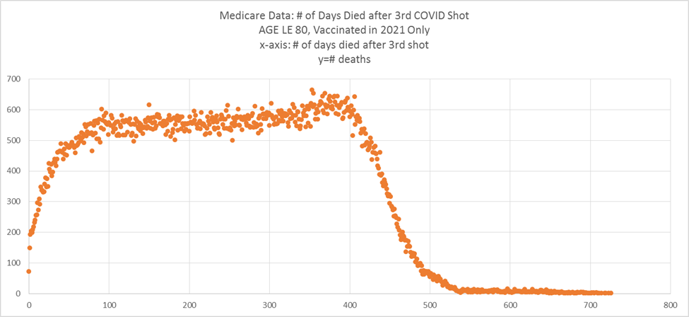
United States Medicare COVID vaccine: not a flat line!
See this article for details.
Shot #1 given at different times.
The first plot makes it easy to count the dots. After 21 days, HVE is over.
So COVID or no COVID, HVE lasts the same amount of time.
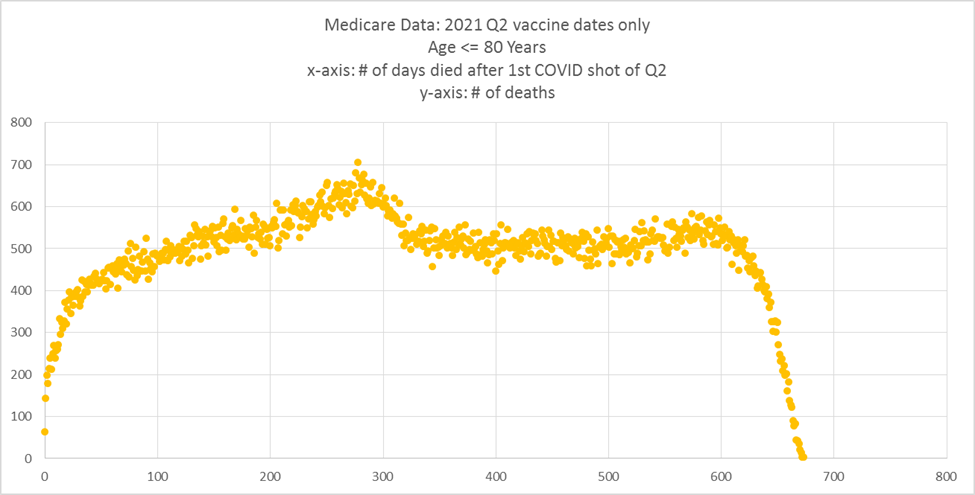

Shot #2

Shot #3
Shot #4… they run out of time to die in the database I had access to.

This seems to obvious. Am I missing something?
No.
It’s like VAERS. There was a STEP rise in mortality reports when the COVID shots rolled out. This was a crystal clear safety signal as well, and they all looked the other way by claiming it was “over reporting.”
Or all the people dying on TV or playing sports. They said, “Oh, that’s always happened. You never noticed it before.”
So yeah, no matter how crystal clear the signal is, it doesn’t get past the cognitive dissonance filter.
Summary
In a safe vaccine, there is a 3 week rise due to HVE and then the deaths per day stabilizes with a mild straight slope based on the average age of the vaccinated cohort.
In an unsafe vaccine, the deaths per day keep rising until levelling off.
It’s so obvious, isn’t it?
The COVID shot time series shows rises in every country because it isn’t a safe vaccine.
But the medical community refuses to admit the obvious.
And I don’t think they ever will. No matter how clear the evidence is.
So I’m just doing my part to document how broken the system is. For the record.
I'm not sure why, but these graphs hit me harder than normal. These are people's lives we're discussing or the end of people's lives at least. Someone loved them. Someone misses them. Most of the people loving and missing them will never even know the truth about why they died if that truth stays buried. Yes, more people are waking up but people who don't understand the math and science of the data or don't have someone to explain it to them, will deny the truth bc it scares them to believe they might have encouraged someone to get the mRNA injections and they might be complicit in those deaths. Nobody wants to be in the wrong where life and death is concerned. That's why malpractice insurance exists. You just pay off grieving loved ones and don't have to admit you killed the person they're grieving. This whole thing is either the biggest medical malpractice case in history or it was a depopulation scheme. There's no third option.
Thank you.
Even the early VAERS data spoke volumes. The main reason for it's existence ignored. Folks collapsing on video and athletes collapsing on the field also on video (in fairly large numbers).
Ed Dowd, brilliantly blowing away the smoke by looking at all cause mortality data.
All the early warnings from experts in their fields censored and suppressed. Etc.
They had and do have the same data we have. #Accountability.