COVID deaths up 39% after vaccines rolled out in Ontario Canada
Weren't the vaccines supposed to REDUCE deaths from COVID? Oddly, there was no press coverage on this. I wanted to make sure you knew about it. Tell your friends.
Executive summary
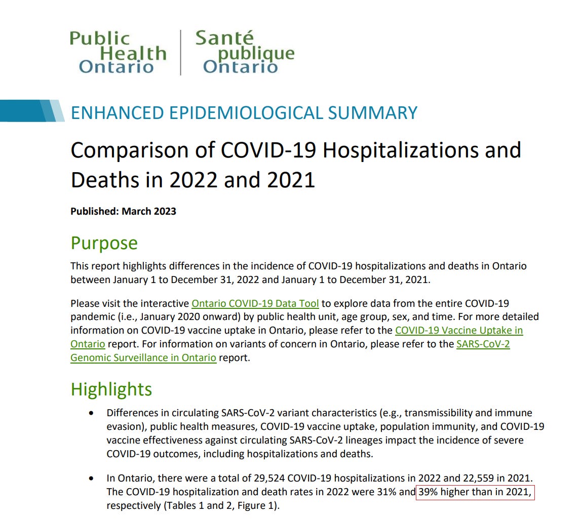
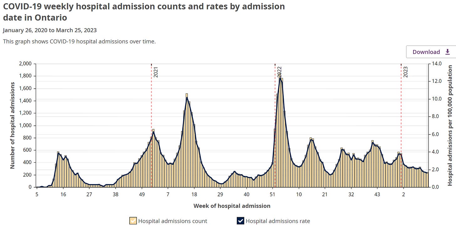
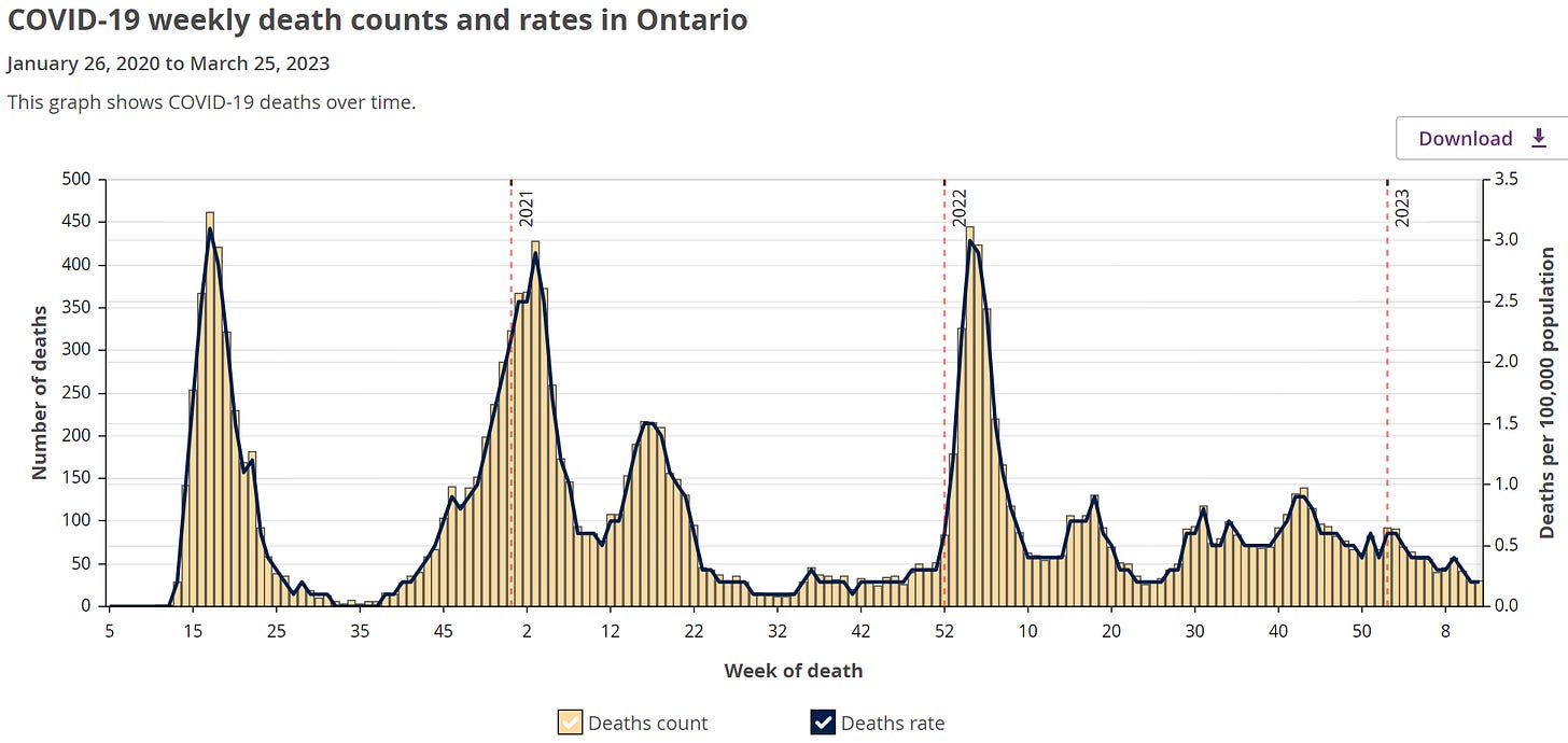
The official government numbers show COVID deaths are up in Ontario by nearly 40% since the vaccines rolled out and hospitalizations due to COVID are up by 31%!
Both hospitalization and deaths from COVID were up dramatically.
Interestingly, excess deaths went up dramatically in H2 of 2022 in the UK as well.
So something common to the UK and Canada capable of killing lots of people is on the loose, and none of the health authorities wants to talk about it at all in either country. If it wasn’t the vaccine, what else could do this that was deployed in both countries at about the same time? It wasn’t COVID (see Figure 1 in that article).
You can see the numbers yourself (see the red box below):
Deaths went from 5,485 in 2021 to 7,625 in 2022. That’s not a death “rate” increase. It is an absolute number of deaths increase.
Could that be statistical noise? Not likely. Sigma is 74 so it’s a 29-sigma increase. In other words, this increase in death didn’t happen by chance; something caused it.
The highlight of this article is when I got one of the “debunkers” (“Debunk The Funk” who I will refer to as DTF below) to try to explain the cause. He failed. Badly. Very badly. But don’t take my word for it; YOU BE THE JUDGE. I’ve included all his explanations below. He basically claimed deaths in 2021 were artificially low due to lockdowns but never produced a calculation showing that (Ontario opened up midway in 2021).
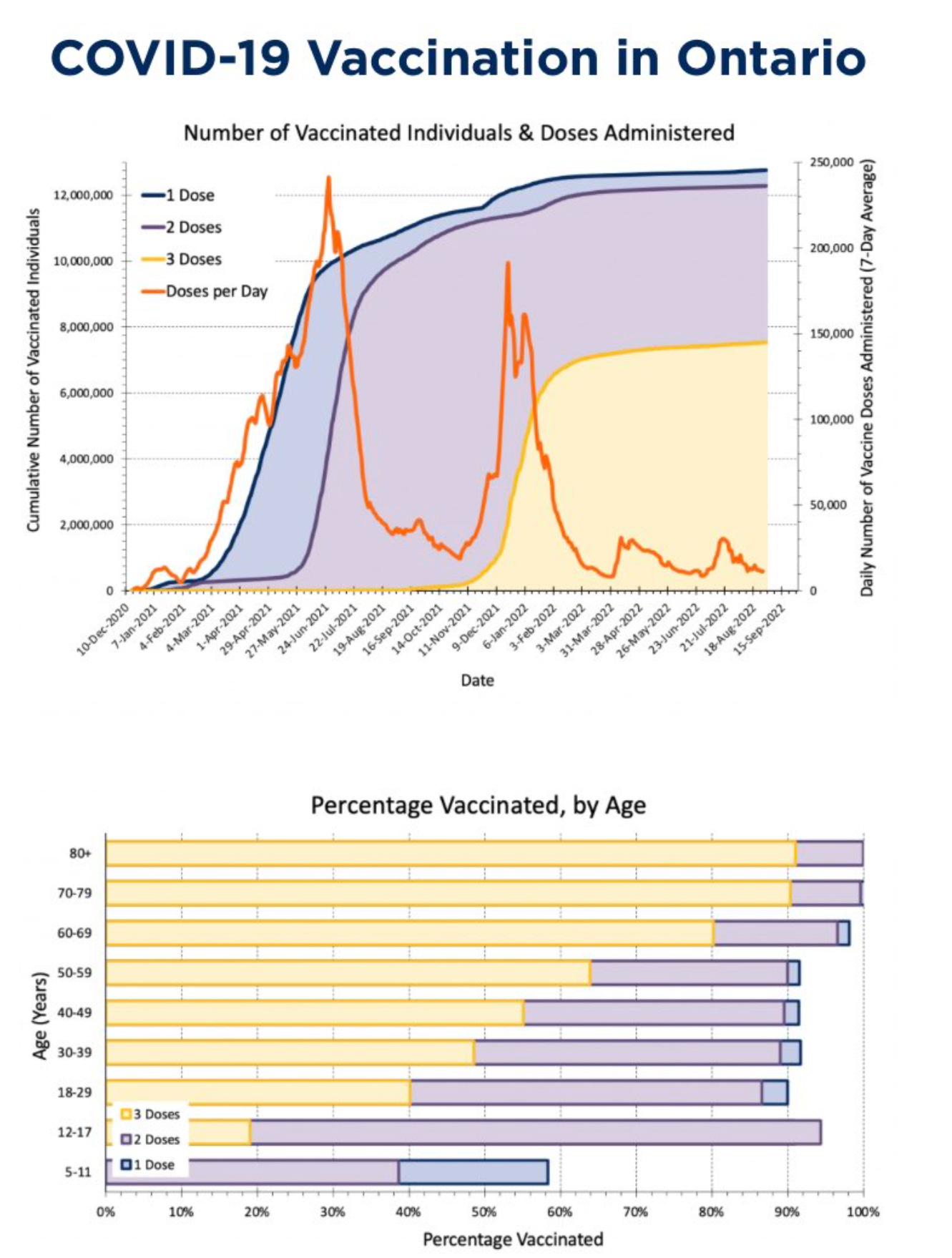
The government report is clear: the absolute number of COVID deaths increased by 39% in 2022 in a region where the elderly (over 60 where the vast majority of the deaths occur) are almost completely vaccinated; in fact, those over 70 have > 90% triple vax rate (as of the start of 2022 and nearly 100% are at fully vaxxed).
So now you have to ask the hypothetical: if the vaccine is lowering your risk of death by a factor of 8X for 95% of the public who have the greatest risk of dying, this basically really limits the number of people who can die at the start of 2022 by a factor of around 6X compared to the rate at the start of 2021 when nobody was vaccinated.
If the vaccines were all delivered to in the first quarter of 2021, then it would imply that the rate of death should by 33% lower in 2022 (all things being exactly equal). But the variants in 2022 were much more milder (by 2x to 4x), so we’d expect that the death rate from COVID would be at least 50% lower in 2022 due to: 1) vaccines rolled out to nearly all the elderly in 2021 and 2) milder variants. Instead we get a 39% increase. It’s hard to explain and DTF can’t explain it (he said it was lockdowns in 2021 until I pointed out that lockdowns don’t reduce death) and nobody else can either.
THIS IS EXTREMELY PROBLEMATIC FOR THE NARRATIVE and attempts to “explain it away” fail miserably.
The data from the Ontario website
We know the vax makes you more likely to get COVID. If you had 3 shots, the Cleveland Clinic study showed you are about 2.5X more likely to get COVID. So that big spike in cases in 2022 is totally expected: it was our own doing. The more people who got COVID, the more people who died from COVID.
In general, you’re less likely to die from a COVID case in 2022 than in 2021 because the variant is less deadly, not because the vaccine worked.
Here’s the rollout schedule for the vaccine:
Other data
Lockdown measures in Ontario were lifted starting on June 7, 2021.
The Omicron variant was 91% of the mix by Jan 3, 2022 in Canada.
In general, Omicron is 4x less deadly than earlier variants:
As shown above, the deaths-to-cases ratio has been pretty consistent throughout the pandemic once our reporting systems were fully established in summer 2020. Deaths have represented about 2% of reported COVID-19 cases. However, that finally changed with Omicron. During the Omicron wave, mortality decreased significantly, with deaths now representing less than 0.5% of reported cases.
Possible explanations
Was this because the virus was more deadly in 2022? I don’t think so.
Let’s look the world’s least vaccinated countries: Yemen, Haiti, and PNG. As you can see, deaths are way down in 2022 because the variants are less lethal:
These numbers show that the “it would have been worse if people weren’t vaccinated” excuse won’t hold any water.
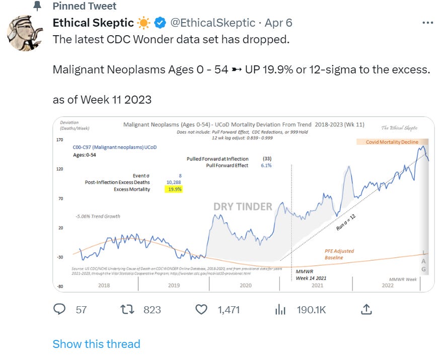
Furthermore, we know the vaccines are super deadly. Consider the following recent post which is based on CDC data:
If it wasn’t the vaccine that caused this dramatic rise, what caused it?
The Debunk the Funk “hand-waving” explanation
Since nobody has proactively given an explanation of this, I reached out to “Debunk the Funk” to see if he could explain the rise in deaths.
Here is my question. Notice it is on DEATHS only (he’ll change the topic to hospitalizations when I ask for the data a second time):
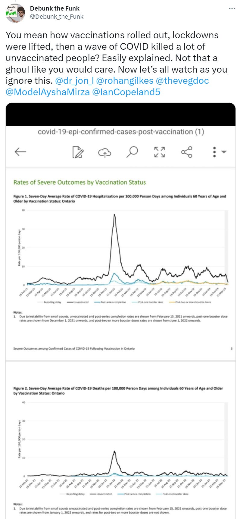
Here is his “hand-waving” response with no calculations at all. The data is by vaccination status until March 2023 which is absolutely astonishing since Ontario stopped publishing data for hospitalizations by vaccination status in June 30, 2022 as noted here.
Debunking “Debunk The Funk” (DTF)
I’m only picking on Daniel Wilson because he’s the only one who offered an explanation for the numbers.
His claims is essentially:
The numbers in 2021 were low because of lockdowns
Only the unvaxxed are dying (the vaxxed are dying at 1/10 the rate)
There are no calculations to explain the 39% death increase which is stunning since lockdown don’t reduce COVID deaths (and largely ended mid-year 2021 which he conveniently doesn’t mention) and the variants in 2022 were less lethal.
He conveys his answer as if it is definitive.
He assumes simply assumes that lockdowns reduced deaths in 2021 with no justification for it and with no calculations whatsoever.
What I should have seen is what source he relies upon for his “lockdowns reduce deaths and hospitalizations” claim that is MORE definitive than the famous Hopkins paper on lockdowns (the Herby paper). I have yet to see a more thorough study on this question. The paper is very impressive. Compare that paper with Dan’s work on the subject.
Next, I should have seen a calculation of the lockdown policies in place over 2021 and 2022 and their impact on death rates.
There is none of that.
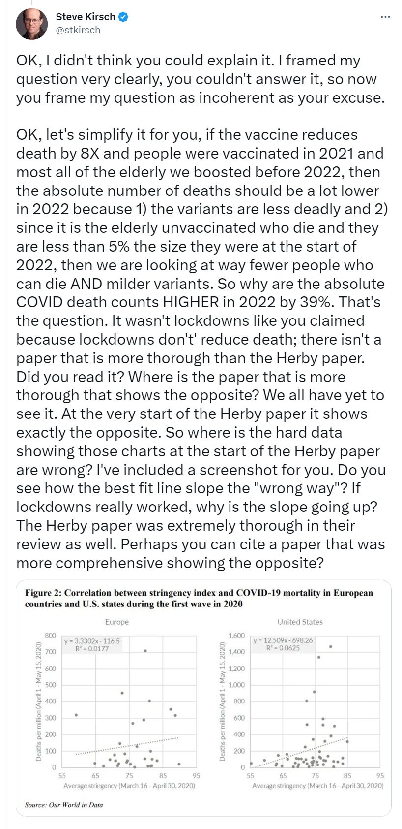
Of course, the calculations are trivial because the impact of lockdowns on COVID mortality was non-existent and, as you can see from the start of the paper, the more lock down policies you have, the greater the COVID deaths (if anything it made the problem worse as you can see by the slope of the best fit line).
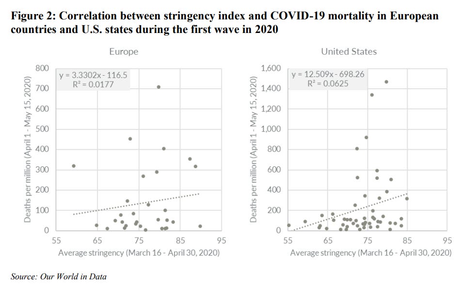
Dan would like us to believe that the 41% increase is because he says it is so, not because he actually did any calculations to back up his claim. I guess that’s how real scientists work!
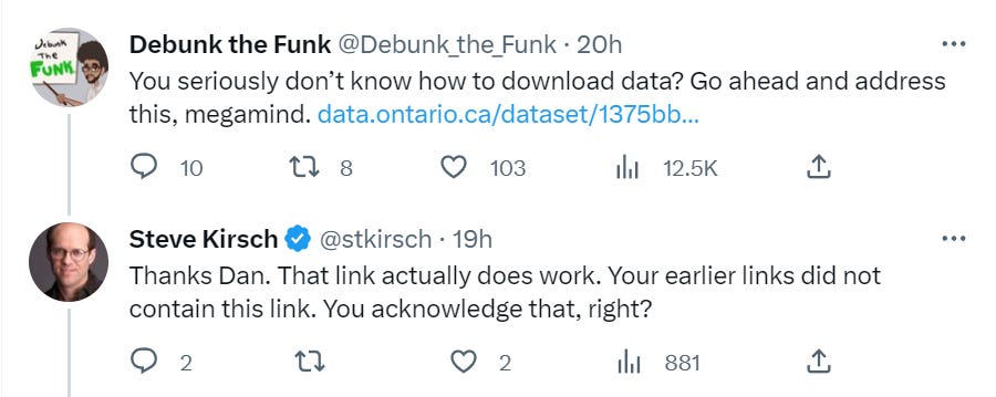
He told me on twitter that he got his data from a different Ontario website (data.ontario.ca vs. publichealthontario.ca).
However, when I tried to download the data from the website he gave me, none of the data was there!
Then he then gave me a different link “to make it easy” (see his tweet) with the graphs. That worked.
But I still wanted the source data for deaths. He deliberately then showed me the hospitalization data which stops in June 2022. But my original question was on deaths. So why point me to the HOSPITALIZATIONS page. Does he not understand the difference?
The bottom line is I asked him for the SOURCE data for those graphs and he should have admitted up front it doesn’t exist for the death or hospitalization curves. Instead he sent me on a wild goose chase to find this non-existing data backing the charts.
He basically wasted my time on a wild goose chase before finally giving me this link of the death data for vaxxed vs. unvaxxed in Ontario.
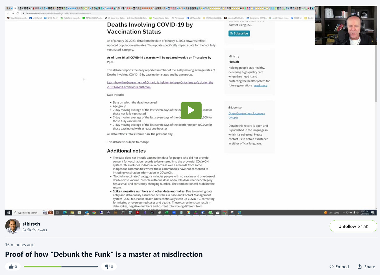
I document all of this in this video showing that the links he gave me led nowhere:
Here are fives ways to debunk his “explanation”:
Method #1: Compare non-lockdown week before vs. after vax
Let’s look at a one week period to compare when restrictions were largely removed.
In early Jan 2022, the restrictions were largely removed and 80% were vaccinated.
We peaked at 120,000 cases, 1,800 hospital admissions, 450 deaths.
But Omicron variant is 4X less deadly than earlier variants (as noted above) so this is effectively (we divide the cases by 4x to make them as deadly as earlier variants on a “per case” basis):
30,000 cases; 1,800 hospitalizations; 450 deaths.
Compare that to 1 year earlier (Jan 1, 2021) when again, restrictions were largely removed but the vaccines hadn’t rolled out yet:
30,000 cases; 900 hospitalizations; 425 deaths.
In short, we were better off pre-vaccine for hospitalization and deaths.
Method #2: Worst case year
There’s a second way to do this which makes the comparison even easier…we can just find the year with the worst case absolute hospitalizations and deaths.
2022 had the absolute highest peaks for both hospitalization and deaths.
The excuse that you had lockdowns in 2020 and 2021 isn’t accurate as Ontario shifted many times from being very open to very locked down throughout the pandemic which is one of the reasons for the peaks and valleys. In fact, one could argue that by 2022, Ontario had become very proficient in monitoring the virus and shutting down quickly.
Method #3: The Herby paper
There is a third way to argue he’s completely wrong and it’s very simple:
A Johns Hopkins study says 'ill-founded' COVID lockdowns did more harm than good which says, “The researchers say lockdowns had no noticeable effect on reducing COVID-related deaths.”
The study is included in that article. Read it. It’s very impressive.
Then read this “fact check” criticism which is one of many that appeared in the mainstream media. In particular, they cite Neil Ferguson as saying, “The Johns Hopkins study defined a lockdown as “the imposition of at least one compulsory, non-pharmaceutical intervention.” This is completely misleading. It sounds great if you never read the Hopkins study. Once you do, you realize that this critique is extremely misleading. Also, they attacked the study because it came from economists rather than the COVID center. You attack the authors when you feel you can’t succeed on the merits of the content.
The quote in that “fact check” article of Marty Makary is telling:
“Johns Hopkins itself did not even put out a press release about this study, and if you look at the media coverage, it’s one of the biggest stories in the world today, and yet certain media outlets have not even covered it,” Makary told Fox News host Tucker Carlson.
Yup. It was a very well done study but the conclusions were counter-narrative, so it got little visibility.
In fact, Wilson’s reasoning actually helps my case because the paper showed (at the very beginning of the paper) that the higher the lockdown stringency, the higher the mortality (whereas Wilson claimed it was the other way around).
Method #4: Deaths rose more than hospitalizations! Whoops!
A fourth way to show his argument is wrong is simply to focus on the rise of hospitalizations vs. deaths. Let’s say that he’s right for a moment and so the rise in hospitalizations reflects his hypothesis that it’s all due to the lockdowns and it’s just the unvaccinated being hospitalized. So why are the unvaccinated people dying at a HIGHER rate than before (since there are 39% increased deaths but only 31% increased hospitalizations? We have better drugs, better treatments, and we have a variant which is 4X less lethal.
Method #5: The unvaccinated are dying at a higher rate when the variants are LESS deadly?!?! Are you kidding me?
We can use his charts to prove he’s wrong. Generally, the method used to show higher deaths in the unvaccinated is simply to misclassify the deaths and move them from vaccinated people to unvaccinated people. This will show up in the graphs because the unvaccinated will be hospitalized and dying at a higher rate than they ever were before (when the variants were more deadly). Even if we assume that lockdowns work, Ontario largely went back to normal on July 16, 2021 for the rest of the year. Now compare the unvaccinated hospitalization and death rates in that period compared to the numbers for 2022 and 2023 when the variants were far less deadly, it shows the unvaccinated are being hospitalized and dying at a much higher rate than before.
How is that possible that there are more deaths among the unvaccinated when the variants are less deadly?
It happens because of misclassification error (counting a vaccinated death as unvaccinated).
See Fig 1 and 2 here to see this.
Method #6: Misclassification errors in vaxxed vs. unvaxxed
Dan finally gave me this link of the death data for vaxxed vs. unvaxxed in Ontario which downloads the death data.
If you believe this data, the vaxxed are dying at a rate that is around 8X lower than the the unvaxxed.
But is that really true?
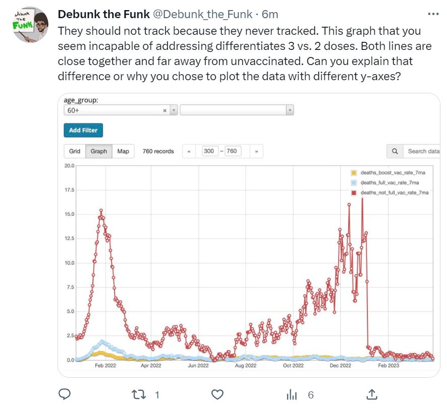
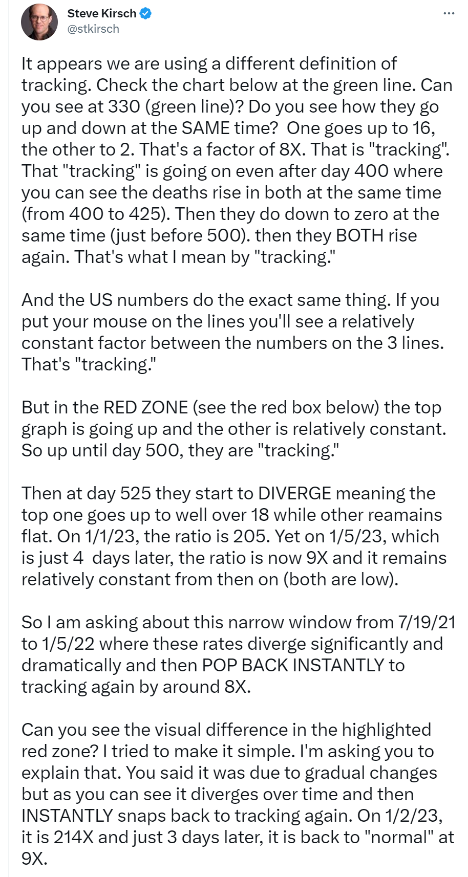
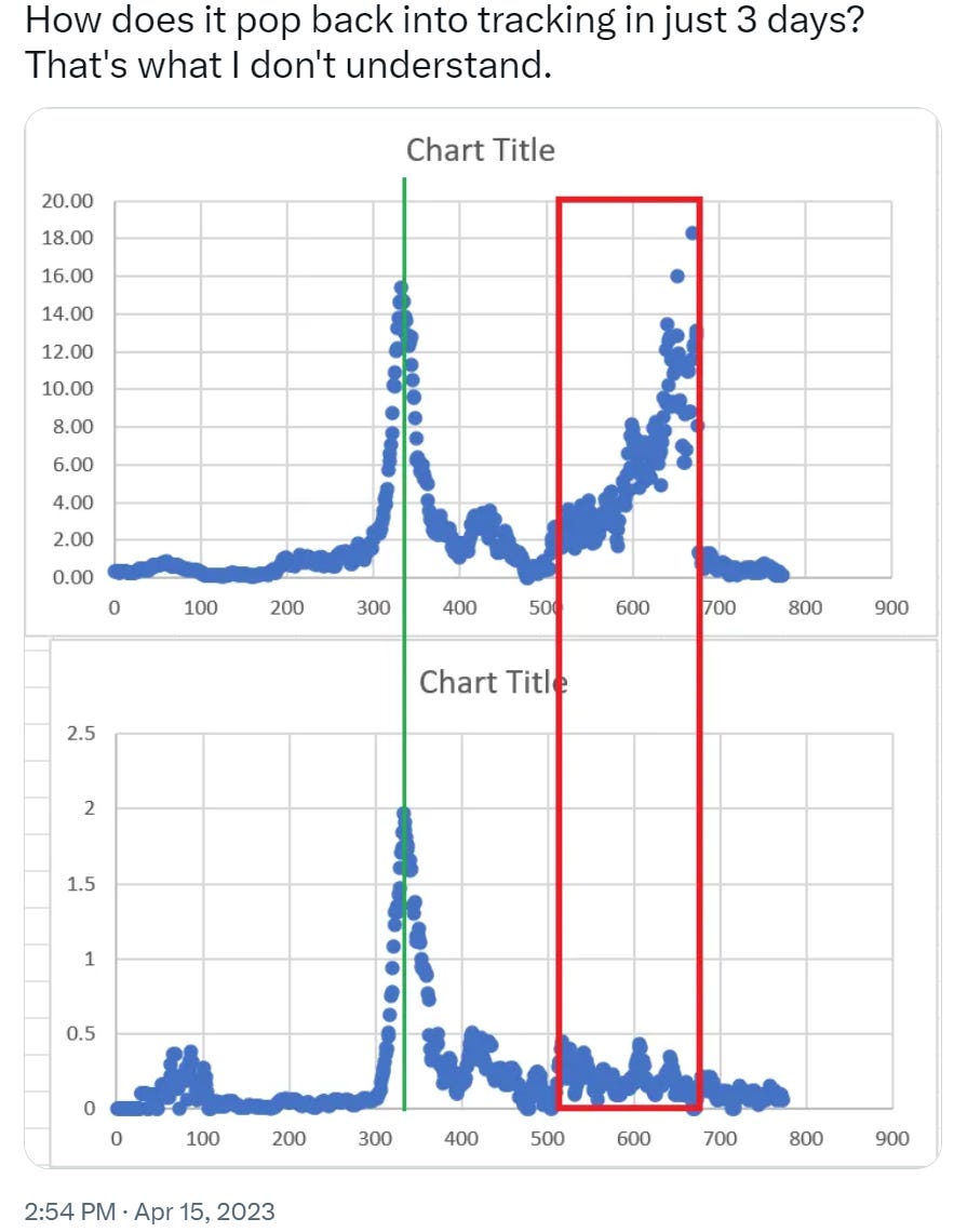
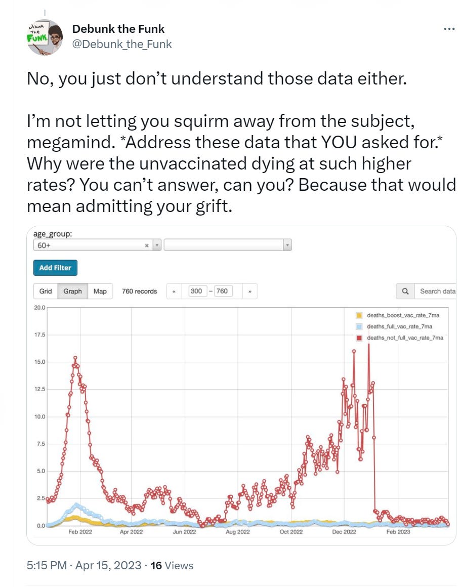
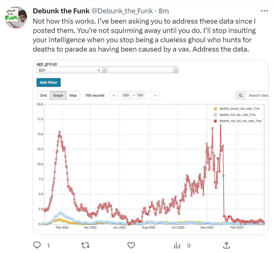
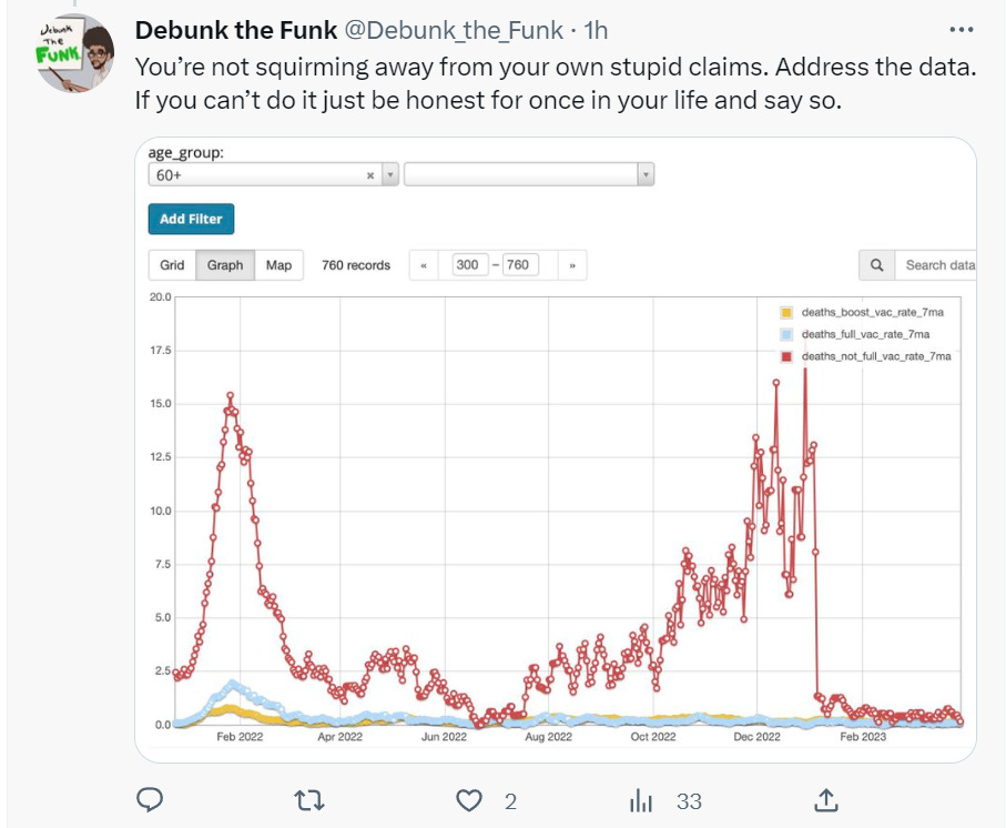
I plotted the unvaxxed / vaxxed rates death rates below for the 60+ age group. Look what I found… they track and then…. wait for it… they don’t… and then they do!! Seriously?!?!
I looked at the 40-59 age group and both charts tracked each other for that age group over all time. Whoops! THERE IS NO WAY TO EXPLAIN THE DISPARITY.
We start to see the scam after day 500 and it abruptly ends at day 675. How can the unvaxxed suddenly be dying at rates far more than they did at the start of the pandemic? In the last year, the variants are around 2X to 4X lower in lethality than the earlier variants.
More concerning, of course, is the the rates for the vaxxed vs. unvaxxed track, then don’t track, and then very suddenly track again after the huge peak on 12/29/22.
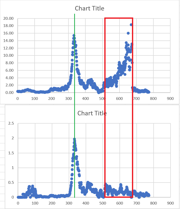
What’s spectacular is this this data starts at Mar 1, 2021. The upper curve shows the unvaxxed are dying at rates never seen before
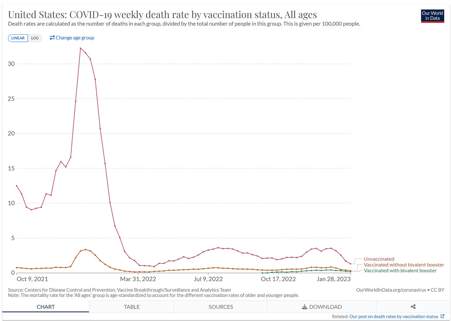
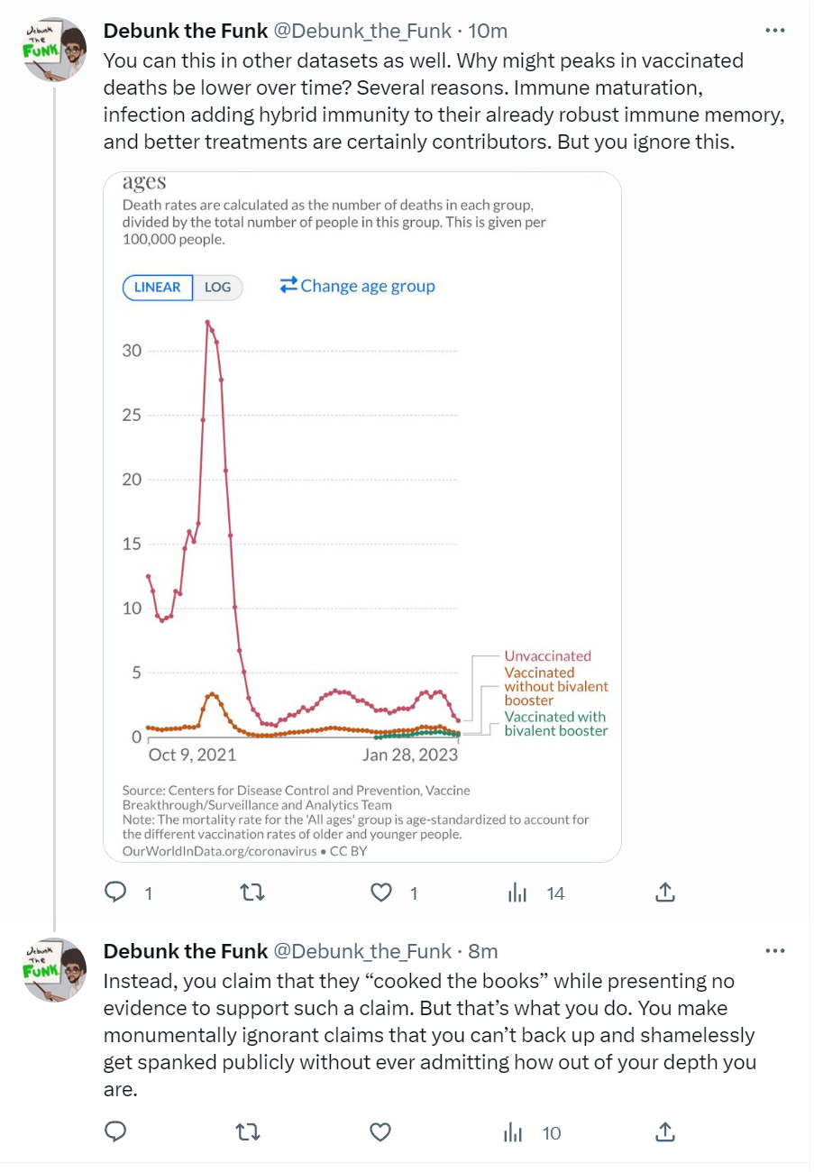
However, that is easily proven false when you look at the US data where the vaxxed vs. unvaxxed track throughout the entire timeframe. It even tracks with those with the bivalent booster (harder to see visually so click on the graph).
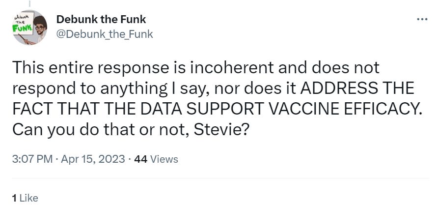
So now DTF continues with the verbal abuse after I challenge him to explain the divergence in the graphs using the data he gave me and comes up with an explanation that doesn’t answer the question (I gave him a curve of doubly vaxxed and he said it diverges because they got the booster which is wrong because that would be the boosted curve, not the “got two doses only” curve). Here is the whole thread to make it easy to follow:
See how his plots have THREE lines? That blue line is the people who ONLY got two doses. I was asking him about how his own red line line can “suddenly” and massively diverge from the blue line starting in July 2022. There is simply no way for anyone to explain this.
So I repeat my request. I show the unvaxxed above and the “fully vaxxed” below.
DTF explains that the fully vaccinated were boosted so that’s why the curves diverge. Sorry, but it doesn’t work that way. The fully vaccinated curve is for those people who are exactly fully vaccinated. There is a separate “boosted” curve for those getting the booster.
Fully vaxxed means EXACTLY two doses, not “at least” two doses. This is important. It can be found in the data dictionary associated with the data files (to see this, download the data dictionary here):
Effective September 13, 2021, individuals are considered fully vaccinated if they have had two doses and the second dose was at least fourteen days ago.
DTF is probably not familiar with reading scientific studies which is how he could make such a rookie mistake. So he digs himself into a hole with this response:
I explain his error:
I thought that would be the end of it, but now he refuses to admit his error and changes the topic:
Wow. Our “expert” here is telling us that they NEVER tracked.
This is an outright lie. A deliberate misrepresentation.
And I explain to him again why I made the plots the way I did.
I’m expecting him to disengage at this point. I don’t know how he is going to explain this.
But I was wrong! To my surprise, he did reply:
and then this:
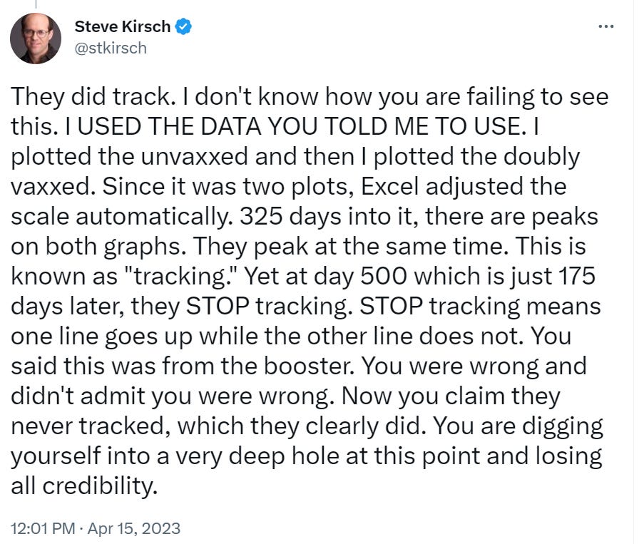
He says that COVID deaths among the vaccinated vs. unvaccinated don’t track because there is almost a 10-fold difference. But that’s not the definition of tracking. Tracking means “when one goes up, the other goes up.” And that’s precisely why I plotted them on different axes so you can see that despite the “almost 10-fold difference” that they do track
So I wrote this response:
I am trying to make this as simple as possible for him to understand.
He then responded he couldn’t understand what I wrote. You be the judge here.
He’s changing the subject using the excuse that he can’t understand what I wrote. You be the judge. Could you understand what I wrote? This is a tacit admission that he cannot explain the divergence.
I pointed out my question was perfectly clear and then shifted back to the main point that his lockdown excuse doesn’t fly (see earlier in this article).
Minutes later I corrected “at the start of 2022” to 2021 (see tweet).
He replied with a NEW explanation for the 39% increase: that Omicron is more deadly and the Herby paper is wrong and incoherent without citing a more definitive study showing the opposite.
My reply sets him up so he has to change the subject to get out of it. Here’s my reply:
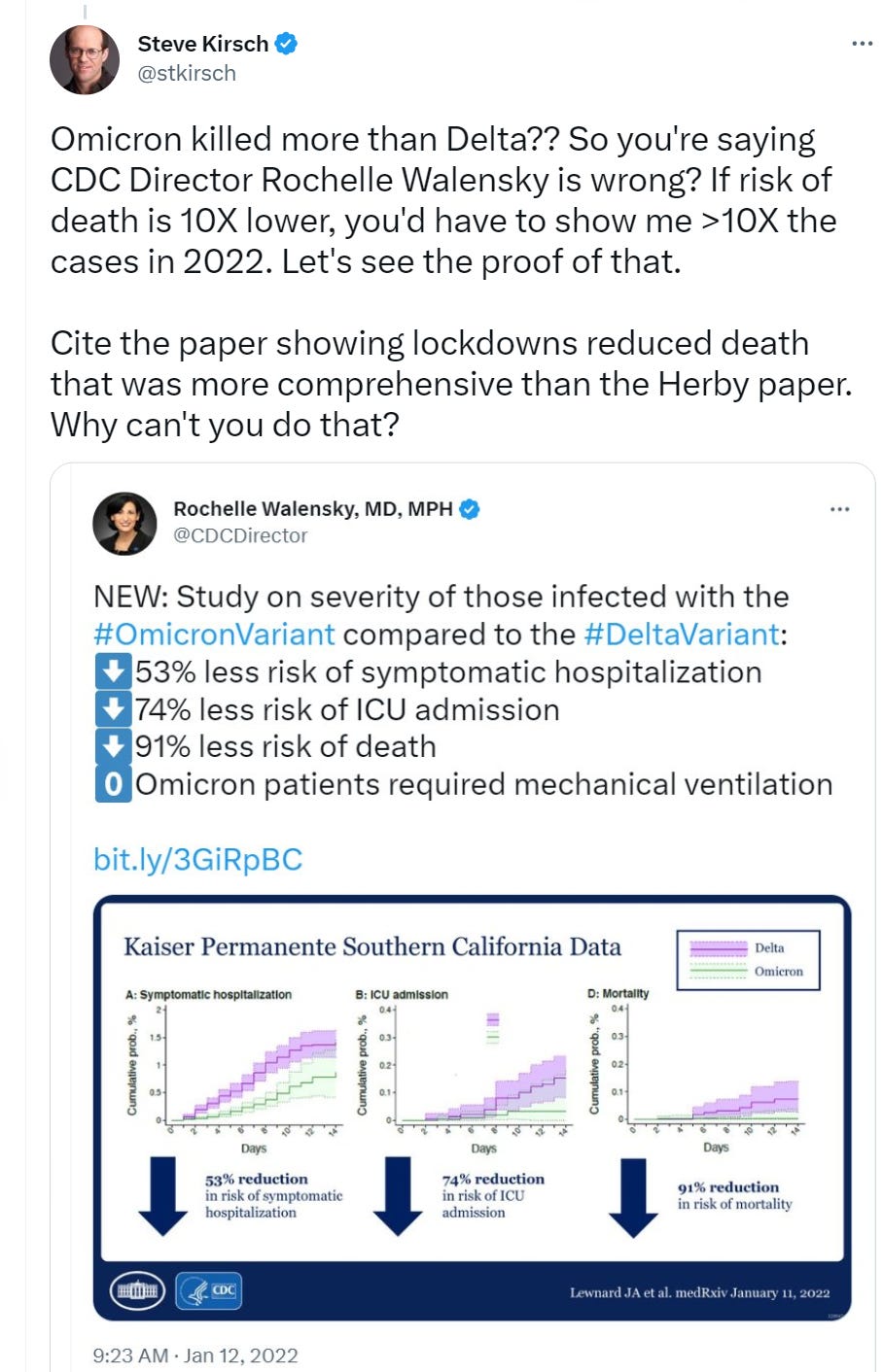
I didn’t even have to use this tweet (in response to Walensky’s):
My followers are mostly unvaccinated and know unvaccinated people. Guess what the results were for these unvaccinated people when I asked them about COVID deaths? Note there is bias in this survey because people are more likely to remember deaths that were more recent. So there’s a 3X lower death rate in 2022.
But DTF hates surveys because they aren’t “scientific.”
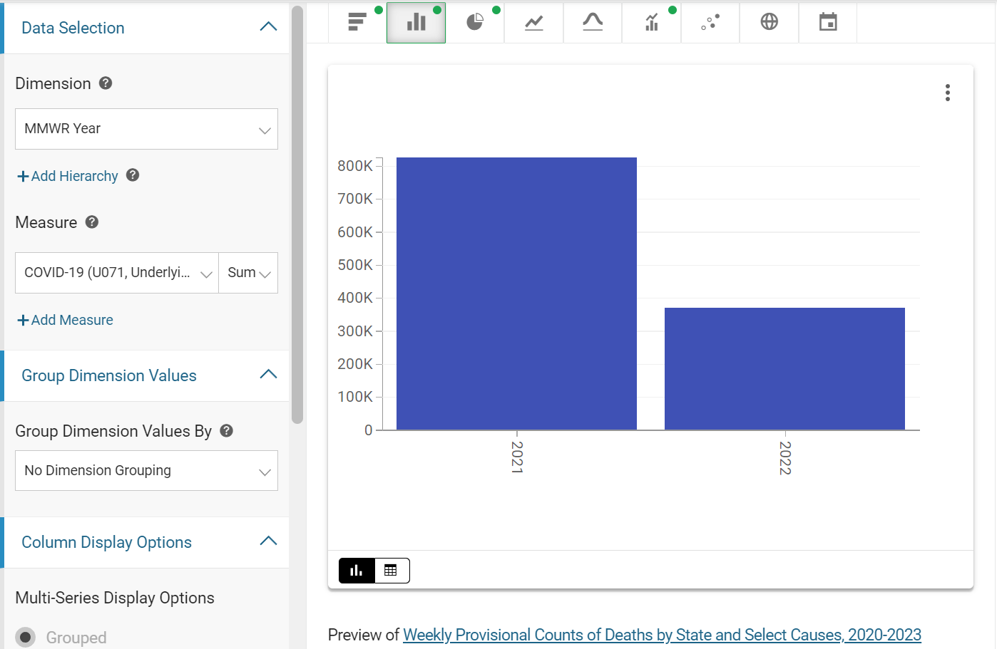
OK, here’s the US COVID death count directly from the CDC. It shows more than a 2X decrease in COVID as the primary underlying cause of death in 2022 vs. 2021.
So the survey of unvaxxed and the CDC data line up that 2022 had way fewer COVID deaths. So it’s hard for DTF to argue that the virus was more deadly in 2022. But he won’t let the data won’t get in the way of his narrative.
As I predicted, he was forced to change the subject to avoid answering my 2 questions (justify lockdowns, justify Omicron). In his response, he doesn’t answer either of my questions. His argument doesn’t reference any data showing I’m wrong. Instead, he insults me as not understanding the data (for asking a question), and then, to divert my attention, he expects me to answer his question. He’s changing the topic to avoid answering my question:
You can’t play his game or it never ends. So here’s my response:
His reply is to stick to his deflection:
My answer is to hold him accountable:
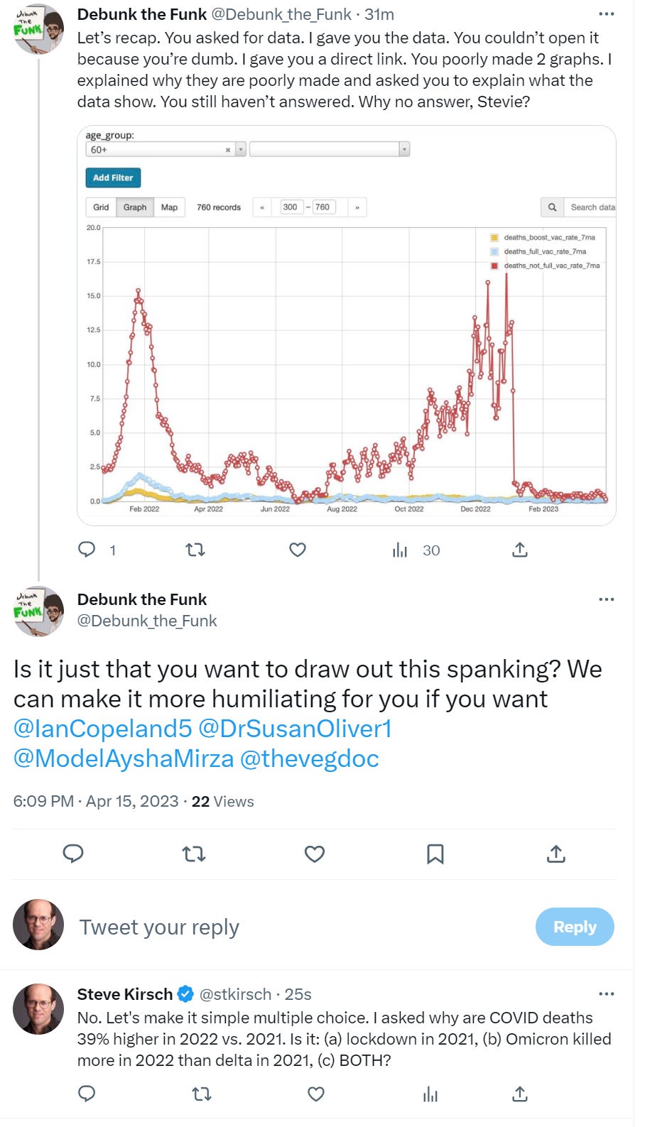
He refuses to answer my two questions which call into question his explanation:
Here’s the latest thread:
He seems much more interested in personal attacks and humiliation (using words like “spanking” and “humiliating” than justifying both of his answers which at first was lockdowns (option a) and then shifted to Omicron is more deadly (option b) and both lacked any evidentiary support. I guess that is how science works in his mind: personal attacks + hand-waving answers = science.
Here’s his reply to my message:
I responded:
And I have evidence to back up my answer to his questions.
If he wants to see my answer, he’ll have to actually present me with an answer that is defensible for why the 39% increase in COVID deaths, or admit defeat.
And he still has avoided explaining the huge deviation inside the red rectangle that I highlighted. He RAN away from that one with insults.
Once he answers my question about Ontario (or admit defeat), I will answer his question with data.
Other arguments
Here’s what Clare Craig wrote:
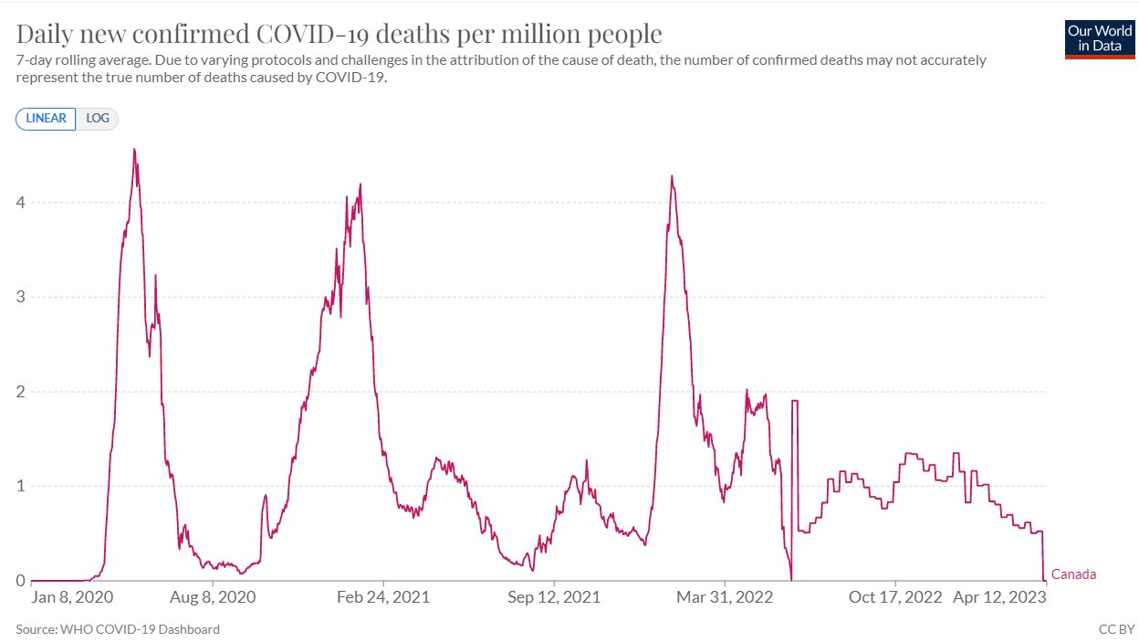
A simpler argument is this. All those at risk of dying from covid were vaccinated in 2021. Why then is the overall rate of dying the same with Omicron as it was with Wuhan and Alpha?
Plus why would the unvaccinated death rate be so many times higher with Omicron than the rate before everyone was vaccinated?
Exactly.
Other interesting data
If the vaccine works so well, how come it doesn’t here:
I don’t know what the rate of vaccination was in Barnstable County, MA in July, but generally it’s hard to get above 70% vaccination and so the numbers are basically showing the vaccination makes no difference in reducing infections.
Summary
So there is no rock they can hide under.
Of course, this is embarrassing for the narrative which is why nobody is talking about it.
Even Professor David Fisman is silent about the report. I reached out to him for an explanation and he ignored it, exactly as expected.
This is why there is no press coverage of this: because the numbers are inexplicable if the vaccine worked; the 2022 numbers should be much lower if the vaccine provided a 10X reduction for 80% of the people.
I just thought you’d like to know.
It’s unfortunate that the mainstream press isn’t covering this.
I can’t figure out why. The press is supposed to report this and get comments from both sides. Instead, they ignore the story.
A nearly 40% increase in COVID deaths and the mainstream press ignores the story.
But I thought people would want to know the truth.
If you want to help support my work to get the truth out, please consider becoming a paid subscriber. Thanks!
And don’t forget to forward this article to your friends so they know the government data as well. Perhaps they might be able to explain to you why this is happening?
















I live in the Niagara region and have seen / heard many with strokes, and loss of balance due to increased neurodegeneration and iatrogenic injury. I've been trying to tell everyone - this is more ammunition for me to spread awareness - thanks so much Steve!
The "Press" has changed their name. They are now to be called "Suppress" - a far more accurate description of what they do.