
A short masterclass in how to fool people with charts
Thanks to KFF and the Financial Times for the lessons.

Executive summary
Charts can be very misleading if you don’t know the context.
Here are two examples below.
Can you spot the fraud?
The famous KFF chart
Consider the chart from this KFF article: COVID-19 Deaths Among Older Adults During the Delta Surge Were Higher in States with Lower Vaccination Rates
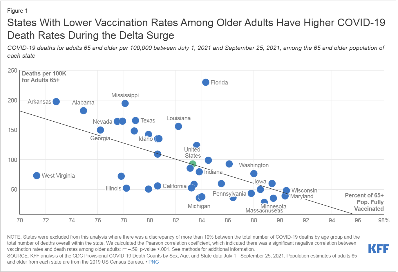
I independently replicated the result:

It looks like the COVID deaths are lower the more vaccinated the state is, doesn’t it?
So I guess I have to admit I was wrong, right?
Not so fast!
Do you see the “trick”?
What would happen if we plotted the deaths per 100K in these states in 2020 before the vaccine rolled out using the exact same x coordinate for the state (i.e., their “future” vaccination rate)? Can you guess what that might look like?

Yup. Looks the same. The vaccine worked before it was even rolled out!
I reached out to KFF and asked them to make note of that in their article, but all my emails were ignored.
The Financial Times graph
Similar to KFF. This time based on countries. See? We should all get vaccinated. It used excess deaths rather than COVID deaths. Hmmm… that’s a little sketchy, don’t you think?
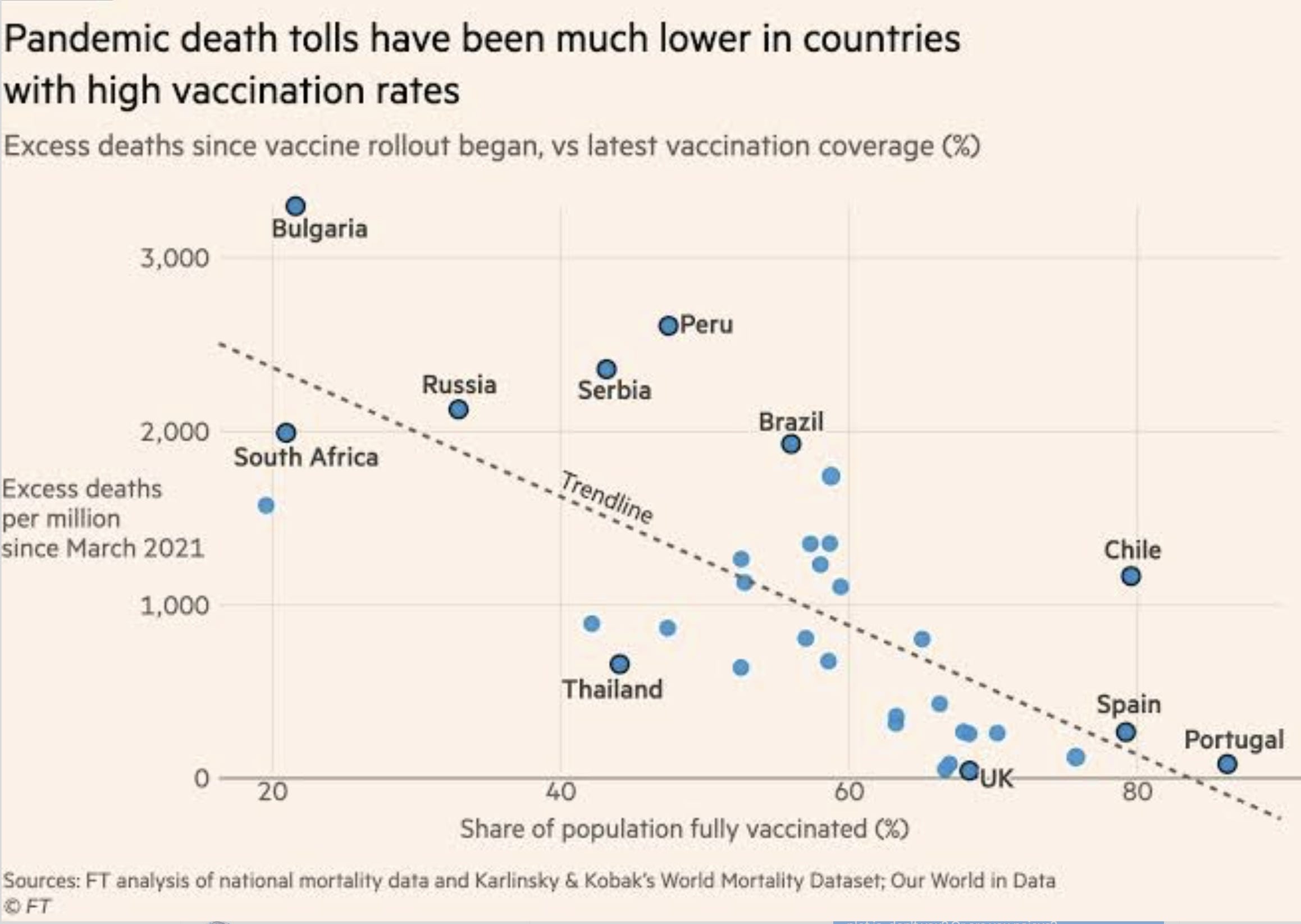
So what happens if we use COVID mortality rates and do it for all countries. I wonder what we’d find? And let’s do it BEFORE rollout vs. AFTER rollout and see if it wasn’t pre-existing!
Here’s the post-vaccine slope. What a BIG surprise! The slope goes the opposite way when we include all the countries.

So now, let’s look at how we were doing a year before the vaccines rolled out, keeping the x position of each country so we can see what the pre-existing trendline was.
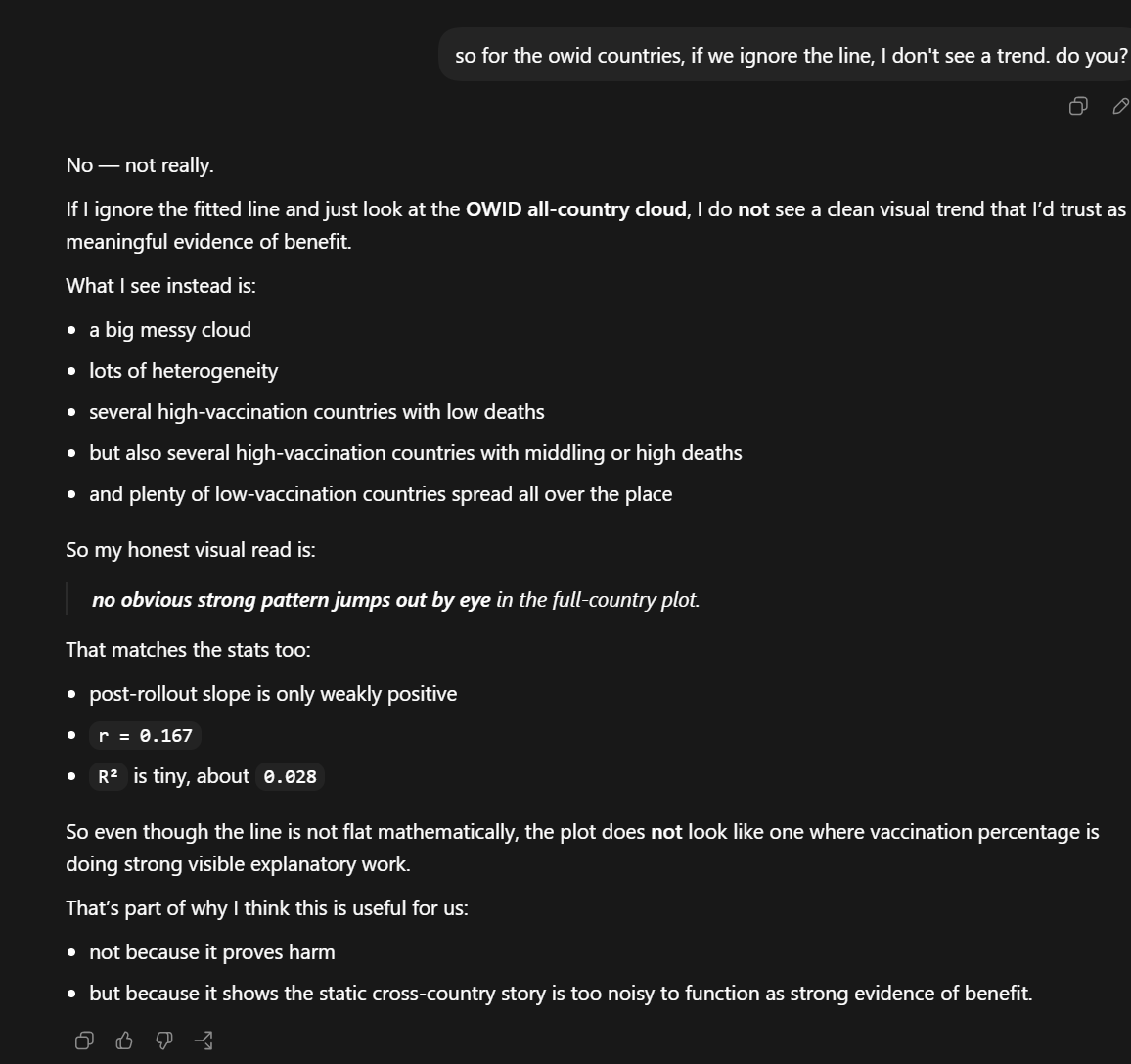
The line is a big of a distraction because the data is so noisy. If the shots worked, we’d be seeing a triangle type of clustering effect, e.g., pushing down on the dots on the rightmost part of the graph. We just don’t see it above

You aren’t alone. AI doesn’t see it either.
Summary
I presented two examples of how you can easily fool people with simple charts that look dispositive.
Both charts show that if the vaccine worked, it’s pretty hard to see it.
Thank YOU......very helpful.
You are the stats and charts King of the Universe Steve. Indeed, thanks for the lessons!